


Last week, I was working on a project and wrote the frontend code for togglable, tag component in React that I was particularly proud of. — you know, that feeling when you get something to work in code and you think, "I'm a genius!" Let's build it!
Here's a look at the final product:
![]()
It's a list of grade levels K - 12. The user can click on any of these items to toggle them or toggle them on or off.
Cool. So, let's jump into the code!
Since this is a React component, let's start by using Create React App.
1
npx create-react-app toggle-gradesThis will take a hot minute.
Sweet.
Now, let's go into our new project folder:
1
cd toggle-gradesand let's start our project:
1
yarn startI'm going to create a file called ToggleTag.js
Within the new file, I'm going to type rafc . This is a snippet that I've set up inside VS Code that will expand to give you a functional react component. I'll include a link to the package in the description below.
1
2
3
4
5
6
7
import React from "react";

const ToggleTag = () => {
  return <div>Toggle Tag</div>;
};

export { ToggleTag };
We'll name our component ToggleTag and make this a named export.
In fact, one of the things I like to do with all my react components is make them named exports. This consistency helps prevent errors in the future. I don't have to think about whether something is a default export or a named export when everything is a named export. I just know.
I'm going to add the word "Toggle Tag" inside the component, just so we know everything is working.
1
2
3
4
5
6
7
import React from "react";

const ToggleTag = () => {
  return <div>Toggle Tag</div>;
};

export { ToggleTag };
Now, I'm going to jump over to App.js and delete a lot of the code that's already in there.
I'm going to import the ToggleTag component that we just created and add it it our render.
1
2
3
4
5
6
7
8
9
10
11
12
13
import React from "react";
import logo from "./logo.svg";
import "./App.css";

import { ToggleTag } from "./ToggleTag";

function App() {
  return <div className="App">
    <ToggleTag />
  </div>;
}

export default App;
I'm going to give it a save and a refresh and you should see our ToggleTag text.
Great! It's working.
... and, as a quick aside, if you're wondering where the styling, like the sans-serif font, is coming from, there's an index.css that has some basic default global styles set up.
Let's jump back over to our ToggleTag.js and start stubbing out the HTML.
Usually, when I'm coding, I like to stub out the HTML first and then I can see how my styles are taking effect as I'm writing my CSS.
When you think about each of these toggle tags, it's just like a checkbox. You can toggle them on and off and within a form, they operate as a group — they're all grade levels.
In HTML, we'll say:
1
<input type="checkbox" name="grades" value="K" /> KOur component in JavaScript looks like:
1
2
3
4
5
6
7
8
9
10
11
import React from "react";

const ToggleTag = () => {
  return (
    <div>
      <input type="checkbox" name="grades" value="K" /> K
    </div>
  );
};

export { ToggleTag };
I'm going to duplicate our component within App.js a few times so we can get a feel for what we're working with.
1
2
3
4
5
6
7
8
9
10
11
12
13
14
15
16
17
18
import React from "react";
import logo from "./logo.svg";
import "./App.css";

import { ToggleTag } from "./ToggleTag";

function App() {
  return (
    <div className="App">
      <ToggleTag />
      <ToggleTag />
      <ToggleTag />
      <ToggleTag />
    </div>
  );
}

export default App;
If we take a look in the browser, we should see something like this:
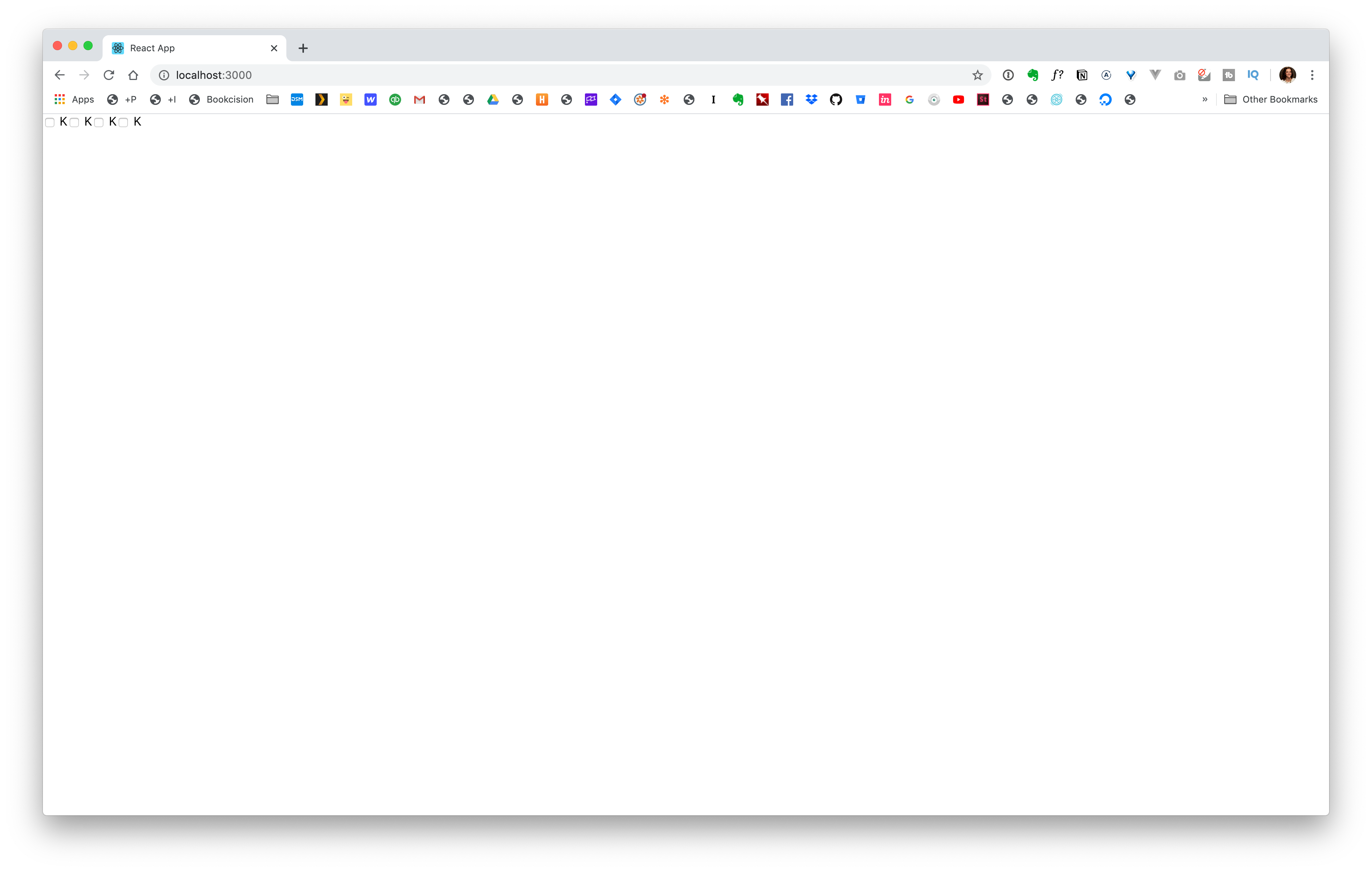
Let's start looking at the styling. One of the first things I want to do is get rid of the checkbox. In our App.css we can get rid of all the boilerplate code that was previously there.
1
2
3
input[type=checkbox"] {
	display: none;
}
Fortunate, for us we can still check and uncheck a checkbox — even with the display turned off, through a label.
Think about it, when you're on a form, you don't necessarily have to click on the checkbox to turn it on and off, you can also click on the text, or the label that accompanies it.
![]()
We'll use that to our advantage.
Going back to our HTML, let's add a label around each of our grades. To help separate our text from the checkbox, I'm also going to wrap all the text with a span tag.
1
<label><input type="checkbox" name="grades" value="K" /> <span>K</span</label>Now, anytime you're clicking on the text, your toggling the checkbox on and off.
You can double check, by turning off the display: none; style. But, you'll see everything is working as expected.
Let's make sure that display: none; is not commented out and we can move on by styling the text.
1
2
3
4
5
6
7
8
9
10
11
span {
  font-weight: bold;
  border: 3px solid purple;
  border-radius: 30px;
	cursor: pointer;
  display: inline-block;
  padding: 5px 10px;
  margin-right: 10px;
  min-width: 50px;
  text-align: center;
}
![]()
Let's give it a little space from the edge of the screen by adding some padding to .App. Then, within our styles:
1
2
3
.App {
  padding: 50px;
}
Now, we just need to handle the click, toggled state. Fortunate, for us, you can target that state within CSS:
1
2
input[type='checkbox']:checked {
}
The only thing is we've hidden the checkbox; we need to target the label next to it. We can actually target the item next to to checkbox with a +:
1
2
3
4
input[type='checkbox']:checked + span {
background: purple;
color: white;
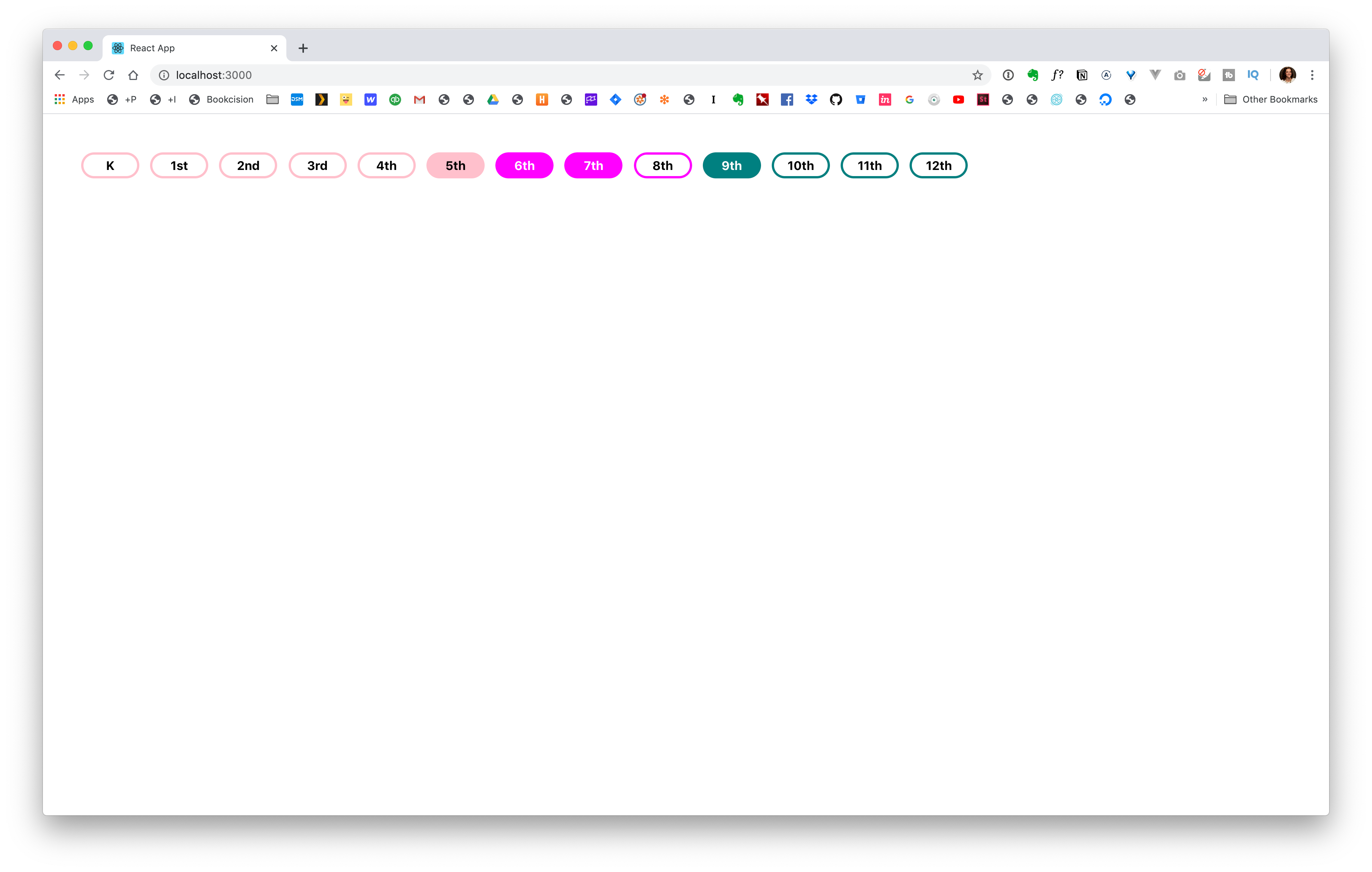
}I wanted elementary school, middle school, and high school to all use different colors. The easiest way to do this is to add a class to each label:
1
2
3
<label class="gradeK">
	<input type="checkbox" name="grades" value="K" /> <span>K</span>
</label>
You'll notice, I prepended the class with grade. I don't think you can have a class start with a number, so this solves that issue.
Now, within our CSS we can target those specifically:
1
2
3
4
5
6
7
8
.gradeK input[type="checkbox"]:checked + span {
  border-color: pink;
}

.gradeK input[type="checkbox"]:checked + span {
  background: pink;
  color: black;
}
We can call these styles our elementary block. We can simply add all the elementary school grades to this block and then create something similar for our middle school and high school:
1
2
3
4
5
6
7
8
9
10
11
12
.gradeK input[type="checkbox"]:checked + span,
.grade1st input[type="checkbox"]:checked + span,
.grade2nd input[type="checkbox"]:checked + span, {
  border-color: pink;
}

.gradeK input[type="checkbox"]:checked + span,
.grade1st input[type="checkbox"]:checked + span,
.grade2nd input[type="checkbox"]:checked + span {
  background: pink;
  color: black;
}
Before, we get too deep down this road, let's remember that this a React component and can be dynamic.
So, how can we make this dynamic?
Let's look at ToggleTag.js. We want our grade level to be a prop that we can pass in.
1
2
3
const ToggleTag = ({grade}) => {
...
}
We can plug that into our checkbox value and label:
1
<input type="checkbox" name="grades" value={grade} /> <span>{grade}</span>For the className, remember we're prepending our class name with grade. So, we want to use string interpolation to add the grade dynamically.
1
<label className={`grade${grade}`}>Now, we need to pass it in through App.js
1
2
3
4
5
6
<div className="App">
	<ToggleTag grade="K" />
	<ToggleTag grade="1st" />
	<ToggleTag grade="2nd" />
	<ToggleTag grade="3rd" />
</div>
One of the things I like to do when I'm coding is just code it out, like we've done here. I try not to worry about writing the DRYest code (Don't Repeat Yourself).
Then, I can start to see some of the patterns emerge. If I find myself rewriting the same block of code over and over again, I know that's a "code smell" and an opportunity to refactor.
I see this within App.js, so let's make this a little cleaner. We could create an object called grades have it loop over all these items. Then, if we need to reuse our list of grades, we don't have to write it again. 🎉
1
2
3
4
5
6
7
8
9
10
11
12
13
14
15
16
17
const grades = [
  "K",
  "1st",
  "2nd",
  "3rd",
  "4th",
  "5th",
  "6th",
  "7th",
  "8th",
  "9th",
  "10th",
  "11th",
  "12th"
];

export { grades };
Within App.js we can import our file and use it to list all of our grade levels:
1
2
3
4
5
6
7
8
9
import { grades } from "./grades";

...

<div className="App">
	{grades.map(grade => (
		<ToggleTag grade={grade} />
	))}
</div>
If we give this a save...
![]()
It looks right, but there's an error in the console:

When you use map it wants you to give each label a key so that React can keep up with them. This could be a number or a string. In our case we know that the value, the grade level, is always going to be unique. So, we can use that as our key:
1
2
3
{grades.map(grade => (
	<ToggleTag key={grade} grade={grade} />
))}
If we give that a save and a refresh, our console error should disappear.
Awesome! So things are shaping up. The one thing we still need to address is the rest of checkbox styles.
If we jump over to App.css, you'll start to see some code smells there too:
Here:
1
2
3
4
5
6
7
8
9
10
11
12
.gradeK input[type="checkbox"] + span,
.grade1st input[type="checkbox"] + span,
.grade2nd input[type="checkbox"] + span {
  border-color: pink;
}

.gradeK input[type="checkbox"]:checked + span,
.grade1st input[type="checkbox"]:checked + span,
.grade2nd input[type="checkbox"]:checked + span {
  background: pink;
  color: black;
}
We're starting to repeat ourselves. How can we make it better?
This is a great place for CSS variables. The cool part about CSS variables is that they're scoped, meaning we can set them up so they only apply to a specific part of code.
You can define a CSS variable by using --. So, within our block, let's create a variable that will only apply to elementary school:
1
2
3
4
5
6
7
8
9
.gradeK,
.grade1st,
.grade2nd,
.grade3rd,
.grade4th,
.grade5th {
	--grade-color: pink;
  --text-color: black;
}
I'm just making up these names, grade-color and text-color. They could be whatever you want them to be.
Let's do the same thing for middle school and high school:
1
2
3
4
5
6
7
8
9
10
11
12
13
14
.grade6th,
.grade7th,
.grade8th {
	--grade-color: magenta;
	--text-color: white;
}

.grade9th,
.grade10th,
.grade11th,
.grade12th {
	--grade-color: teal;
	--text-color: white;
}
For the record, I'm just using the standard color names, but you could also plug your hex colors in.
Now, we need to use these. Let's delete this block that we had created previously:
1
2
3
4
5
6
7
8
9
10
11
12
.gradeK input[type="checkbox"] + span,
.grade1st input[type="checkbox"] + span,
.grade2nd input[type="checkbox"] + span {
  border-color: pink;
}

.gradeK input[type="checkbox"]:checked + span,
.grade1st input[type="checkbox"]:checked + span,
.grade2nd input[type="checkbox"]:checked + span {
  background: pink;
  color: black;
}
The same concept still applies, but we're going to have it driven by this block of code that we've already written:
1
2
3
4
5
6
7
8
9
10
11
12
13
14
15
16
span {
  font-weight: bold;
  border: 3px solid purple;
  border-radius: 30px;
  cursor: pointer;
  display: inline-block;
  padding: 5px 10px;
  margin-right: 10px;
  min-width: 50px;
  text-align: center;
}

input[type="checkbox"]:checked + span {
  background: purple;
  color: white;
}
Now, let's plug in our variable names. To do that we use var() and put the name of the variable inside:
1
2
3
4
5
6
7
8
9
10
11
12
13
14
15
16
span {
  font-weight: bold;
  border: 3px solid var(--grade-color);
  border-radius: 30px;
  cursor: pointer;
  display: inline-block;
  padding: 5px 10px;
  margin-right: 10px;
  min-width: 50px;
  text-align: center;
}

input[type="checkbox"]:checked + span {
  background: var(--grade-color);
  color: var(--text-color);
}
Give that a save...
WINNING!

Comments
This industry moves fast, but you can stay up to date:
Receive a weekly email of the Internet's best from articles, to tutorials, to pro tips.