


Today we're going to dive into creating a progress bar in HTML and CSS.
Let's jump into the code.
I have a bare bones HTML page:
1
2
3
4
5
6
7
8
9
<html>
	<head>
		<title>Progress Bar</title>
		<link rel="stylesheet" href="styles.css" />
	</head>
	<body>

	</body>
</html>
Pretty simple. A head and body tag. The head includes a title tag, just to label our page and the link tag allows us to reference an external stylesheet.
I like to start out by stubbing out HTML and then writing the styles to go with it. The HTML gives me something to hang my CSS on.
Within our body let's use an unordered list. We're going to let each list item represent a segment in our progress bar:
1
2
3
4
5
6
7
<ul class="progress-bar">
	<li>Step 1</li>
	<li>Step 2</li>
	<li>Step 3</li>
	<li>Step 4</li>
	<li>Step 5</li>
</ul>
In the browser, this is what we're looking at:
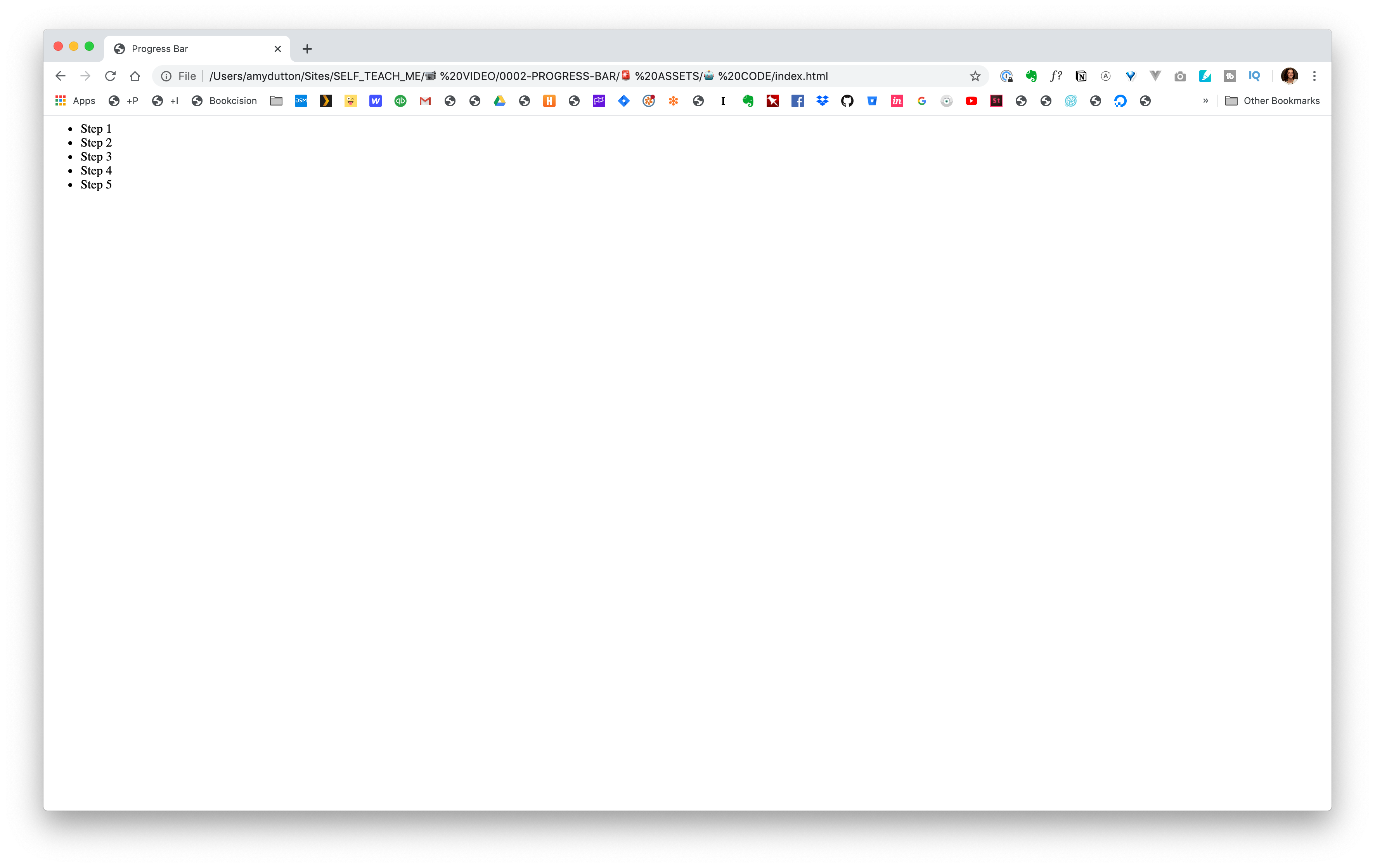
Pretty bland.
Let's talk through our requirements and strategy:
- We've already said that we want each list item to be a dot in our progress bar.
- We want the text to only be displayed for the current step.
- Ideally, we want our speech bubble to use the text inside our list item. That would keep things nice and semantic for accessibility and screen readers.
- Steps that we've already completed should be one color, steps in the future should be another color.
Anytime you're coding, just take it one step at a time. We can use our list as an outline for how we want to tackle this. So, first up: each list item should be a dot in our progress bar.
Let's remove the current bullets and have the list display horizontally.
1
2
3
4
5
6
7
8
.progress-bar {
align-items: center;
display: flex;
justify-content: space-between;
list-style-type: none;
margin: 0;
padding: 0;
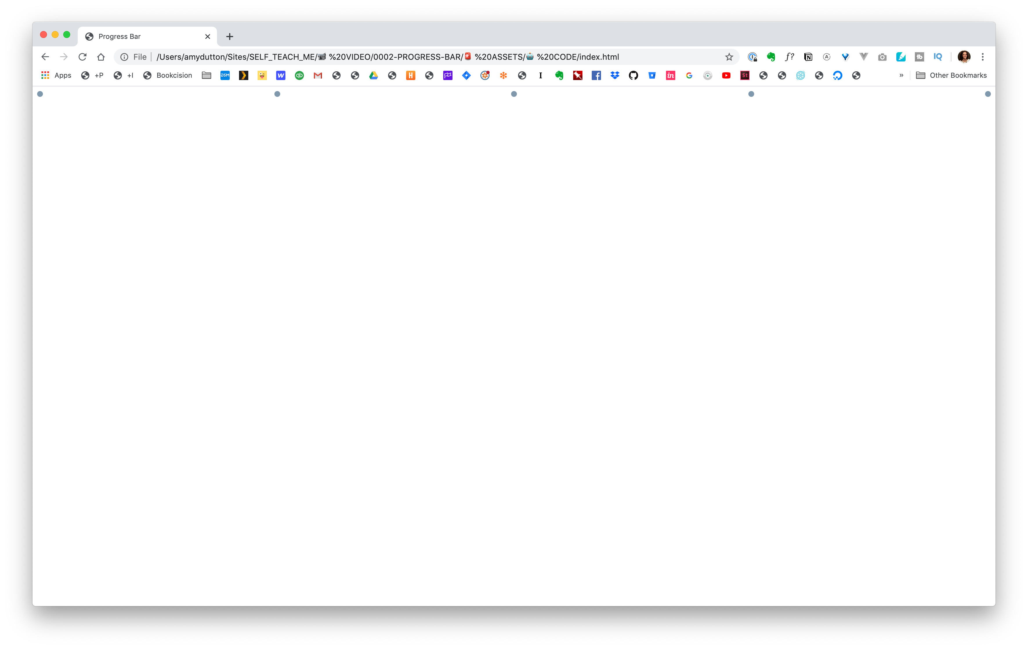
}We want circles for each item:
1
2
3
4
5
6
7
li {
  background: #7f98ac;
  border-radius: 50%;
  display: block;
  height: 10px;
  width: 10px;
}
Awesome.
The text should appear in a speech bubble and only be displayed above the current item.
Let's go back to our HTML and add a little more mark-up to make it easier to control through CSS.
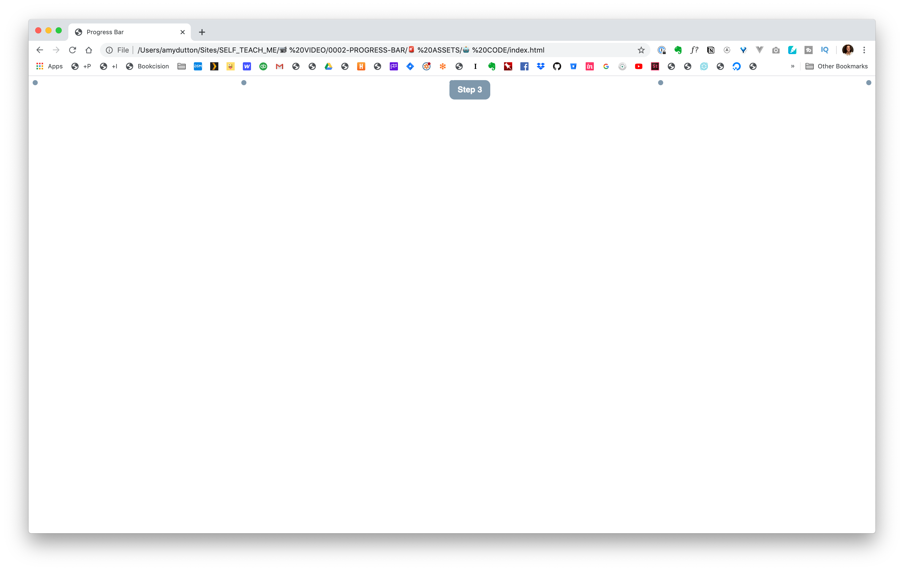
I'm going to add a class of current to the current item.
1
<li class="current">Step 3</li>To make it easier to style the text and separate it from the list item, I'm going to wrap the content with a span.
1
2
3
4
5
6
7
<ul class="progress-bar">
	<li><span>Step 1</span></li>
	<li><span>Step 2</span></li>
  <li class="current"><span>Step 3</span></li>
  <li><span>Step 4</span></li>
  <li><span>Step 5</span></li>
</ul>
Good, good.
Now, in CSS, we can hide the text:
1
2
3
li span {
  display: none;
}
Within the browser, this is what we're looking at:
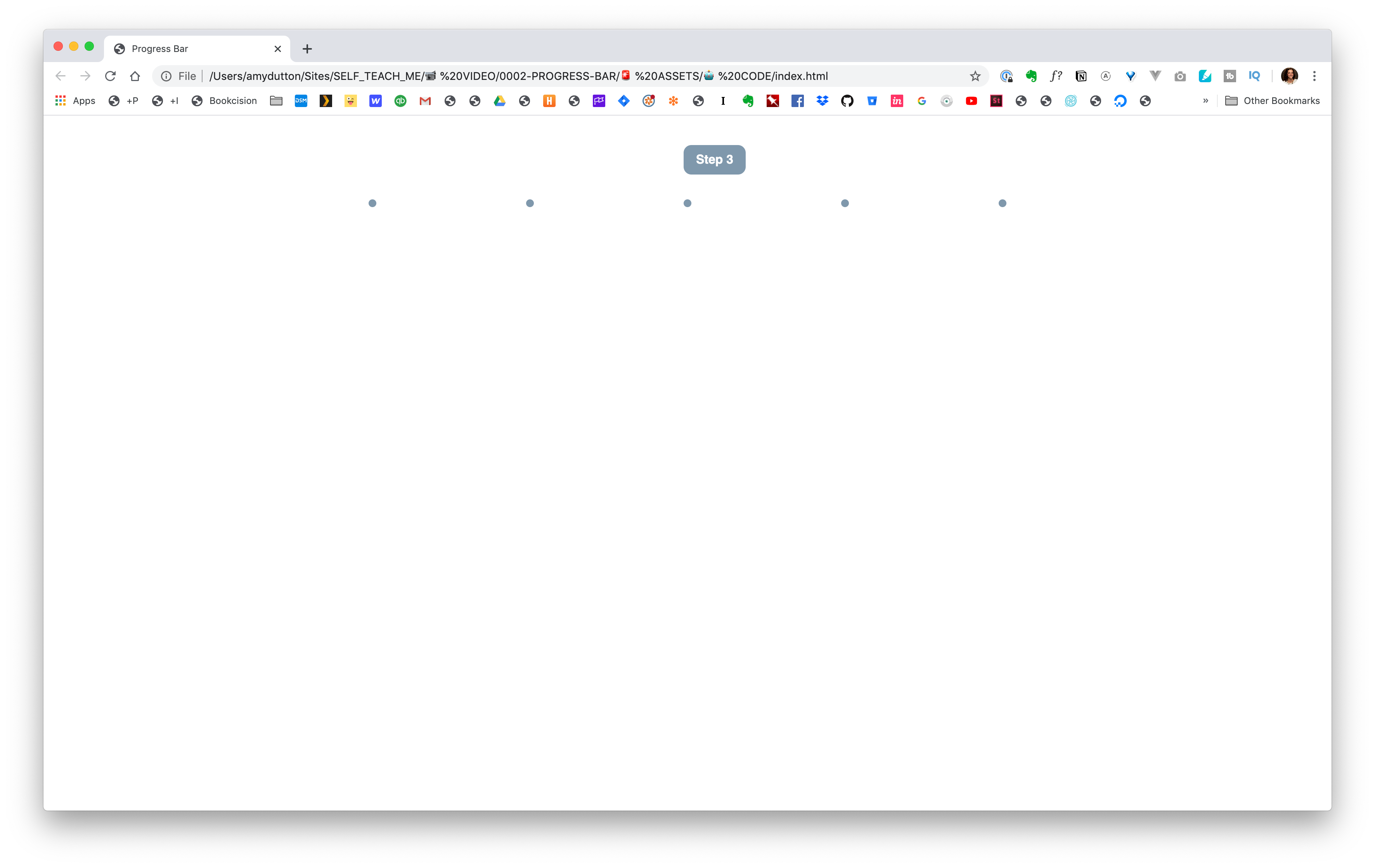
Then, display it only for the current item:
1
2
3
li.current span {
  display: block;
}
Now, let's get that speech bubble. This takes a little bit of CSS trickery, but can be done completely within CSS:
1
2
3
4
5
6
7
8
9
10
11
12
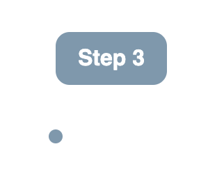
li.current span {
  display: block;
  font-family: sans-serif;
	font-weight: bold;
  color: white;
  padding: 10px 15px;
  background: #f40082;
  border-radius: 10px;
  text-align: center;
  min-width: 50px;
  height: auto;
}
So, far this is what we have within the browser:
It's looking good, we just need to place it. If we use absolute positioning, we can move it above the correct dot pretty easily. Just remember that positioning is always relative to its parent. To make sure that the bubble is above the correct dot and not the entire page, we need to give the parent a positioning of relative too.
1
2
position: absolute;
top: -70px;
When we added that, our bubble went off the page. Let's add a wrapper around our progress bar to give it some space:
1
2
3
4
5
6
7
8
9
<div classs="wrapper">
	<ul class="progress-bar">
		<li><span>Step 1</span></li>
		<li><span>Step 2</span></li>
	  <li class="current"><span>Step 3</span></li>
	  <li><span>Step 4</span></li>
	  <li><span>Step 5</span></li>
	</ul>
</div>
I'm going to put our wrapper styles at the top of the page so that our CSS reads similar to our HTML, top to bottom.
1
2
3
4
5
6
.wrapper {
  max-width: 50%;
  margin: 0 auto;
  padding: 100px 50px;
  position: relative;
}
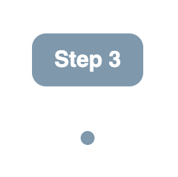
Great! Now, we just want that tag centered over the dot.
We can add this line left: 50%; However, you might have been surprised to see our box shift slightly to the right. — And it's definitely not centered. The upper left corner is placed at the center of our dot, but not the center of our speech bubble.
If you Goggle this, you might see some people resolve it with a negative left margin. This works if you know the width of your object, but in our case, we don't. "Step 1" is not going to be as wide as "Step 100." That might sound ridiculous, we're not going to have 100 steps, but you get the idea. We want our code to be as flexible as possible and handle for these types of use cases.
There's actually a pretty easy solution.
1
transform: translateX(-50%);This moves our center point over 50%. Perfect.
Now, we just need a little tag, tail, triangle — whatever you want to call it from our speech bubble.
This will seem a little bit of a hack — and honestly, I always look this up when I code it. But, let's talk through how this works.
We're going to use the pseudo element, after to inject code after the span.
When you use an after you have to use the content property to get it to display. We don't have any content so we can just set it to empty.
1
2
content: "";
display: block;
We want it to be positioned absolutely, to the bottom of the speech bubble, -10px.
1
2
bottom: -10px;
position: absolute;
We want it to be centered, so we're going to use our transform / translateX trick:
1
2
left: 50%;
transform: translateX(-50%);
Now, here's the magic — the triangle. Let's talk through how this works, first.
Let's take a box and add a border to each of the sides. I've given each side a different border color to make it easier to visualize.
Now, if you give the box a width and height of 0, this is what it would look like.

You can start to see the triangles.
In our case, the tag is going to point down, so we can get rid of the bottom border.
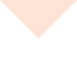
Then, all we need to do is make the side borders transparent, leaving our triangle!
The code for that looks like this:
1
2
3
4
li.current span:after {
  width: 0;
  border-style: solid;
}
When we're listing out our border, we're going to start at the top, and work around the box clockwise: top, right, bottom, left.
1
border-width: 15px 15px 0;Since, we didn't list a left it will assume the same value for right. Same for the border-color:
1
border-color: #f40082 transparent;Again, since we didn't list a value for the bottom it uses the same value for the top and the left uses the same value for the right.
Altogether now:
1
2
3
4
5
6
7
8
9
10
11
12
li.current span:after {
	content: "";
	position: absolute;
	bottom: -10px;
	left: 50%;
  border-width: 15px 15px 0;
  border-style: solid;
  border-color: #CCC transparent;
  display: block;
  width: 0;
	transform: translateX(-50%);
}
![]()
Last step.
We want to style our circles based on the status: past, current, future.
Let's add some additional mark-up to our HTML:
1
2
3
4
5
6
7
<ul class="progress-bar">
	<li class="completed"><span>Step 1</span></li>
	<li class="completed"><span>Step 2</span></li>
  <li class="current"><span>Step 3</span></li>
  <li><span>Step 4</span></li>
  <li><span>Step 5</span></li>
</ul>
For a step in the past, this is pretty straightforward:
1
2
3
li.completed {
  background-color: #171546;
}
![]()
We can leave the gray, the default color, for the future.
We just need to style the current item.
1
2
3
li.current {
	background-color: #f40082;
}
Let's take this one step further and add an extra ring around the current state. We can create a faux double border.
The "first" border will be white, the same as the background color:
1
2
3
li.current {
	border: 1px solid solid white;
}
Then, we can create a "second" border with a box-shadow.
With box-shadow the first property is the horizontal offset, the second value is the vertical offset. We want both of these to be 0. The 3rd value is blur. We want to have a hard edge so that it looks like a border. So, that's 0. Spread is the 4th value, that's basically a border width, so 2px. Last value is the color: #f40082.
1
box-shadow: 0 0 0 2px #f40082;Give that a save and refresh the browser:
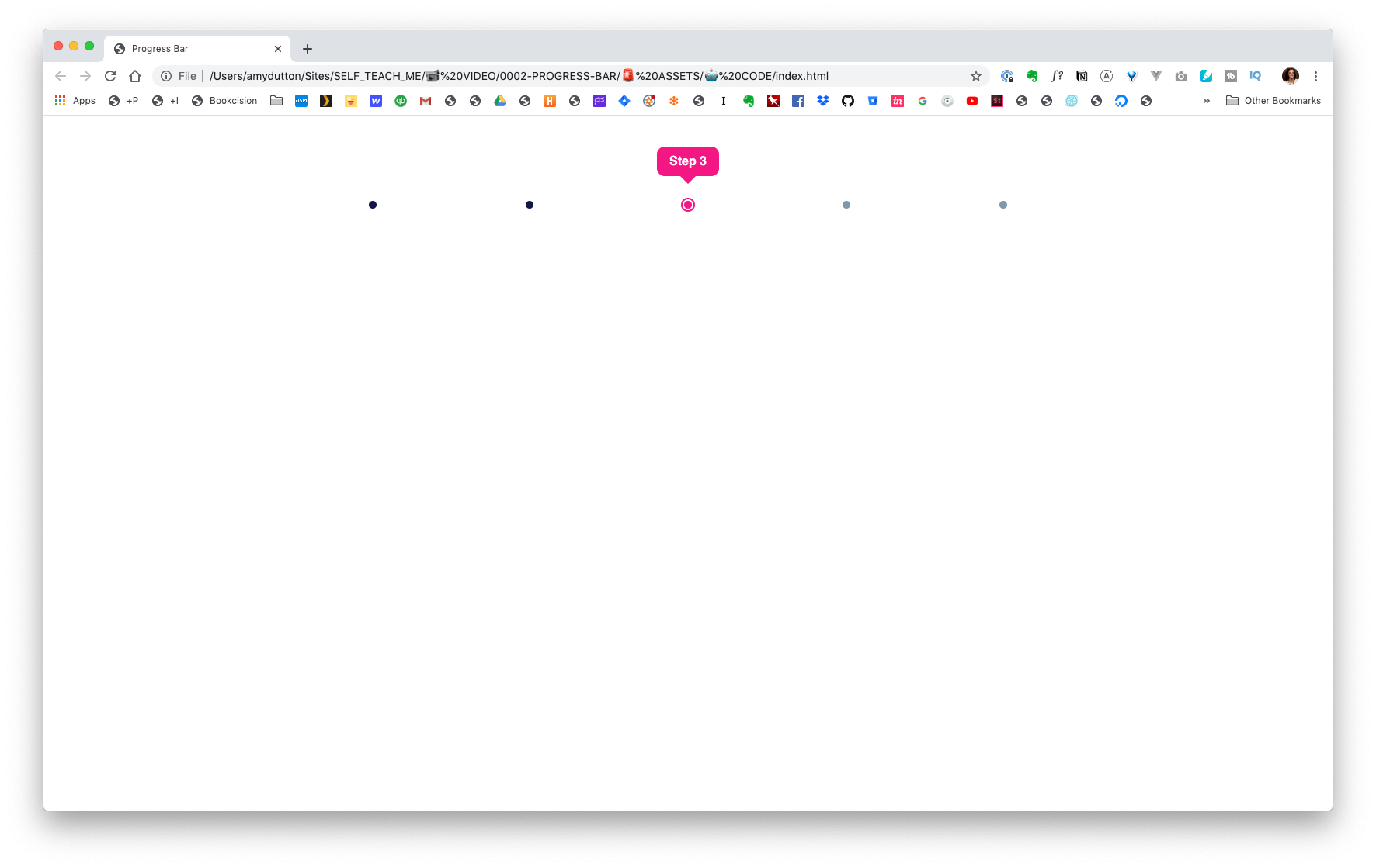
Winning!

Comments
This industry moves fast, but you can stay up to date:
Receive a weekly email of the Internet's best from articles, to tutorials, to pro tips.