


The Problem
Recently, I was working on a project that needed a wifi icon. It was for a React project. The idea was that you would be able to pass the status of the wifi icon as a prop and it would update the display.
The icon had 7 different states!
- Off
- Searchinig
- Error Connecting
- Poor Connection
- Fair Connection
- Good Connection
- Excellent Connection
Then, just to add another level of fancy, when you're in searching mode, the icon animates.
So, how do you go about building something like this? First, things first...
Getting Our Hands Dirty in Code
Let's open a Terminal window I'm going to create a react project with Create React App:
1
npx create-react-app wifi-svgLet's navigate into the directory that was created and run our application:
1
2
cd wifi-svg
npm run start
You'll notice that it automatically refreshes our browser. You should see a spinning React logo, indicating that our application is running properly
Within App.js let's modify some of the code. Within our paragraph tag, I'm going to change the text to read, "One wifi to rule them all."
I'm also going to delete our img tag.
Let's change most of the code within App.css, too. Remove everything except what's inside the .App and .App-header class.
Let's change the background color to the nice, deep purple #171546.
1
2
3
4
5
6
7
8
9
10
11
12
13
14
.App {
  text-align: center;
}

.App-header {
  background-color: #171546;
  min-height: 100vh;
  display: flex;
  flex-direction: column;
  align-items: center;
  justify-content: center;
  font-size: calc(10px + 2vmin);
  color: white;
}
Next, let's create a Wifi component where we'll be doing most of our work.
Inside of the src directory, let's create a folder called Components. Let's create a file called Wifi.js.
Within our new file, I'm going to type rafc and tab. I have a snippet running inside VS code that will use this shortcut to automatically stub out a functional React component.
Let's name our component Wifi.
1
2
3
4
5
import React from "react"

export const Wifi = () => {
  return <div></div>
}
Inside the return statement, let's just add the text Wifi so that we can make sure it's rendering correctly.
💡
Whenever I create a React component, I always use named exports. Using a consistent approach makes everything so much easier. You don't have to try to remember which components have a default export and which ones have a named export because everything uses a named export. Consistency means less room for error.
1
2
3
4
5
6
7
import React from "react"

const Wifi = () => {
  return <div>Wifi</div>
}

export { Wifi }
Within App.js let's import our new component:
1
import { Wifi } from "./Components/Wifi"and display it inside our <header> tag.
1
2
3
4
5
6
7
8
9
10
11
12
13
14
15
16
17
18
import React from "react"
import logo from "./logo.svg"
import "./App.css"

import { Wifi } from "./Components/Wifi"

function App() {
  return (
    <div className="App">
      <header className="App-header">
        <Wifi />
        <p>One wifi to rule them all.</p>
      </header>
    </div>
  )
}

export default App
Save the files and you should see everything automatically reload within our browser:
Perfect.
Building the Icon for Export
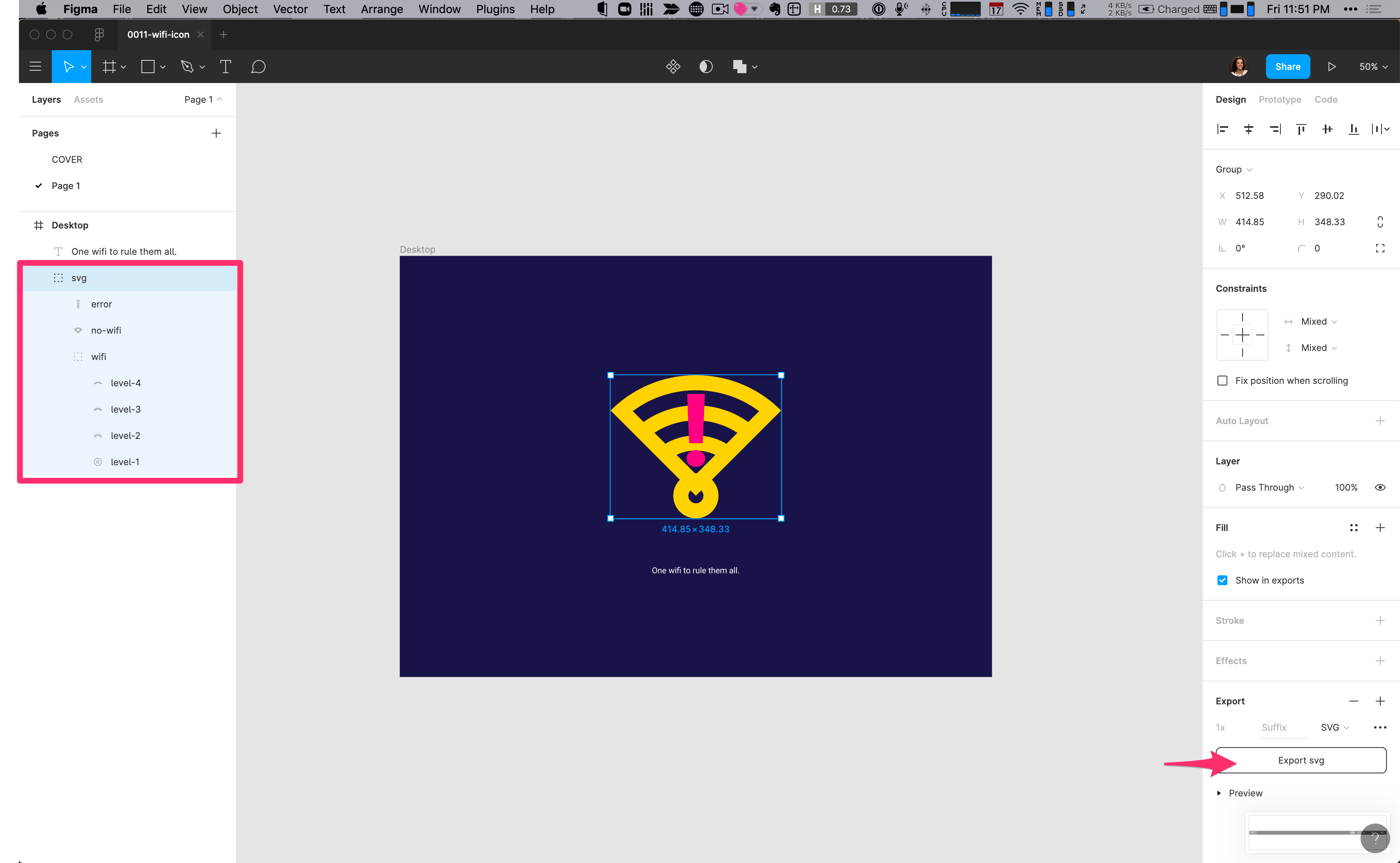
Let's jump over to Figma where I mocked up what we'll be creating.
You'll see all the various wifi states stacked up on top of each other:
- You'll see the wifi icon that we can use to show all the different levels of connectivity. This will also be animated to show the searching state.
- We'll change the opacity of the wifi icon and turn on the exclamation icon for the error state.
- I also have a wifi off symbol.
The easiest way to get this out of Figma and into code is to stack all these icons on top of each other, group them together, and export it as a single SVG.
Bringing the SVG into our Code
Now, let's open the SVG image from Figma directly inside of VS Code.
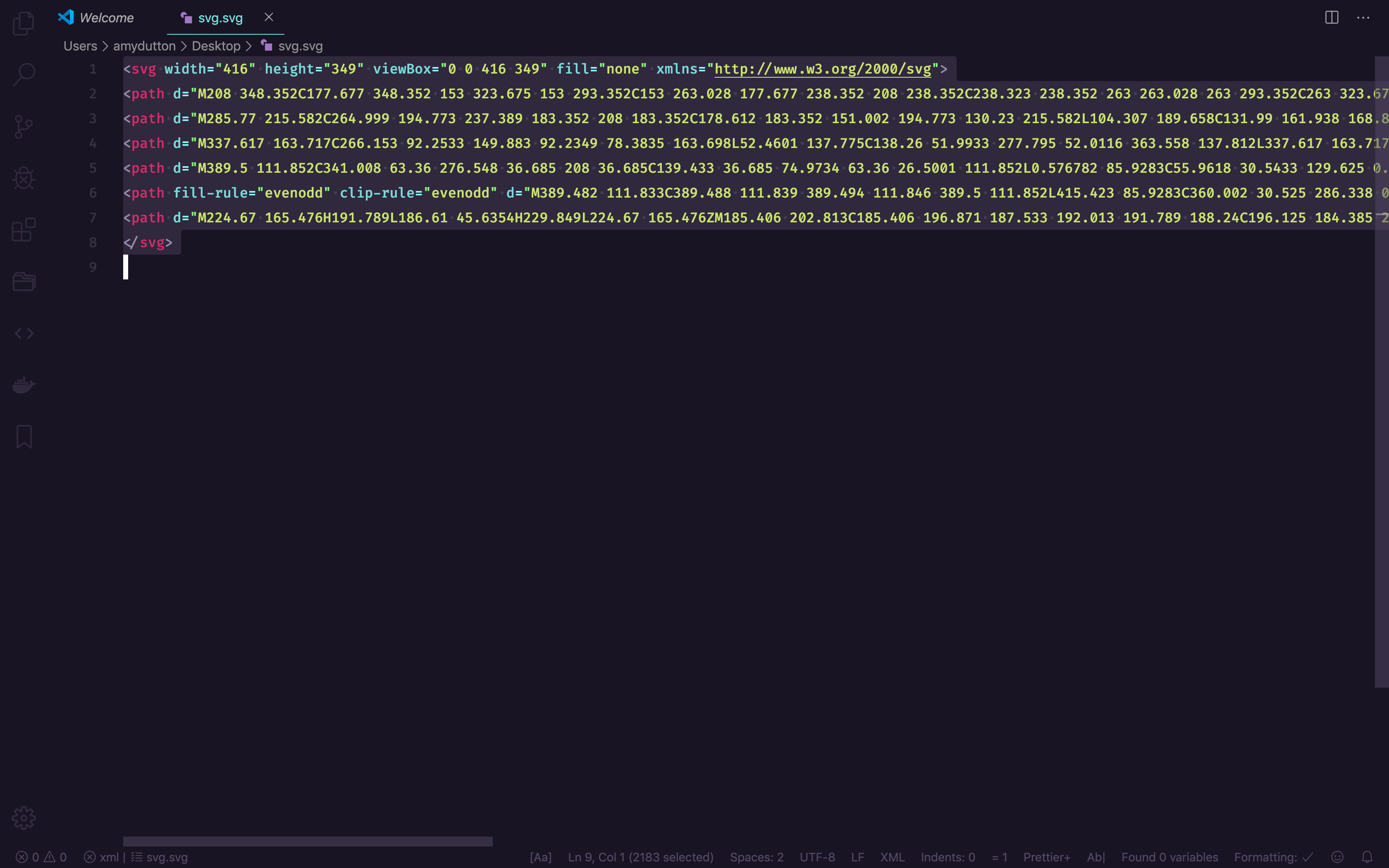
It looks a little crazy with lots of numbers and letters.
If you don't have a lot of experience with SVGs, you can think of it like an Illustrator file for the web. It's a vector file, which means that the lines are text coordinates, based on math. Whereas, a raster image file is based on pixels. The good news about an SVG is that you can make it as big or as small as you'd like and change the color, all within code. Additionally, the file can be compressed and cached easily since it's text.
We're going to copy all of the SVG code and paste it directly within our Wifi component.
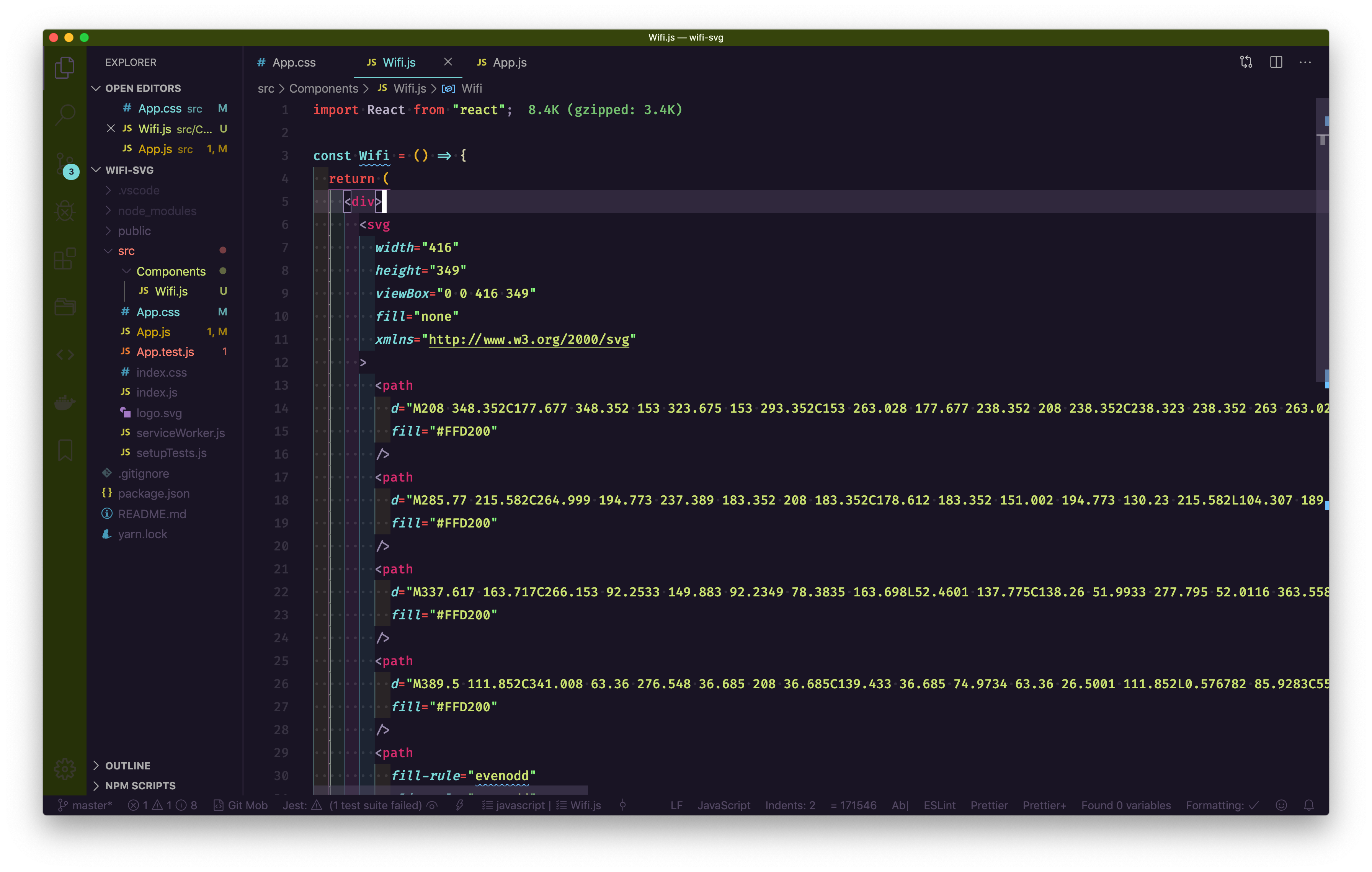
As soon as I hit Save, you'll notice that VS Code automatically reformats my code for me. That's because I have an extension installed within VS Code called Prettier. It is fabulous! I'll include a link to it within the description below.
Now, I'm going to clean up our SVG file. Most of the time when Illustrator or Sketch exports an SVG, they include a lot of extraneous code and metadata that isn't needed for display.
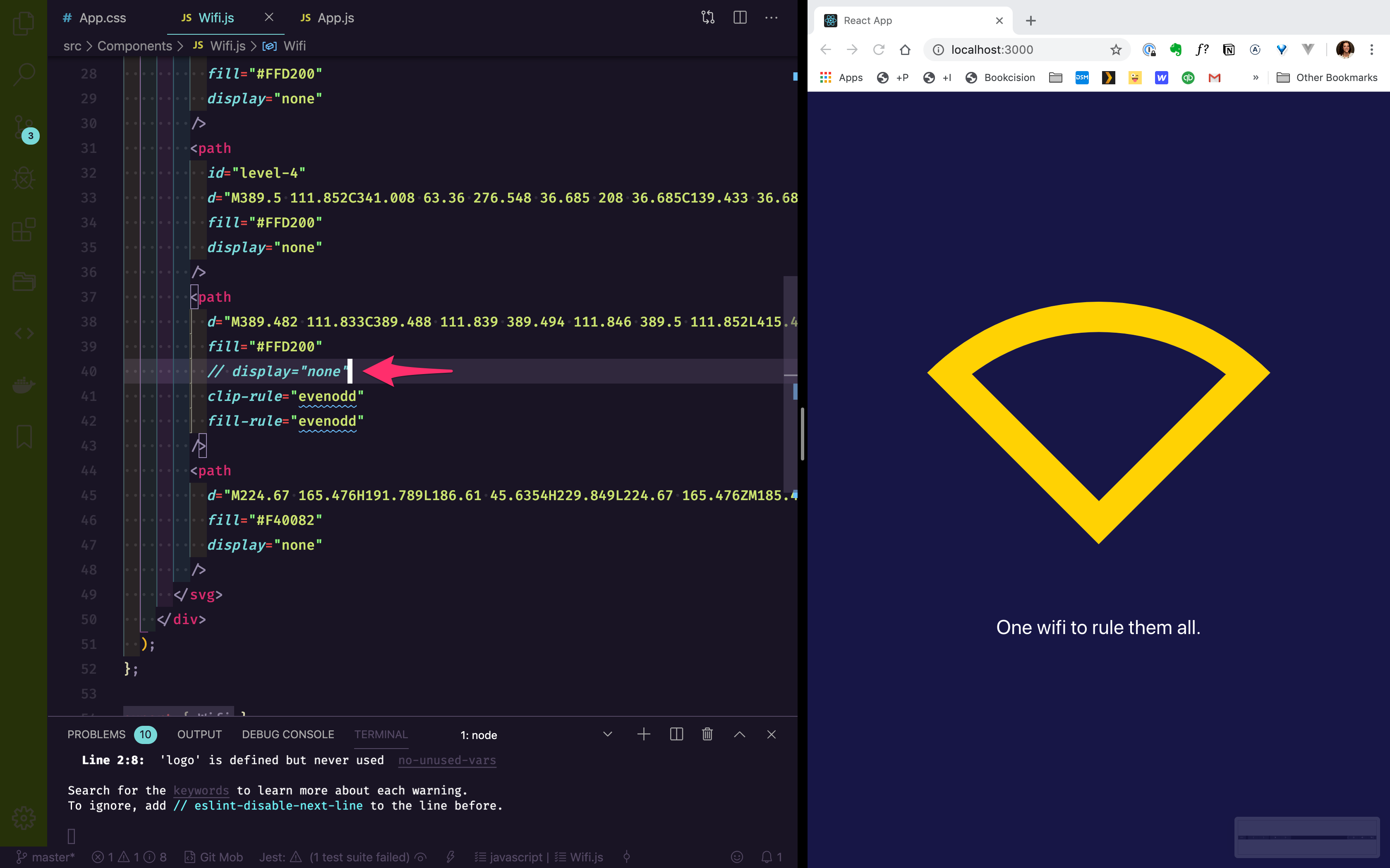
Now, I want to figure out what each path refers to. I'm going to add a style="display:none;" to each path. We can turn them back on one by one to determine.
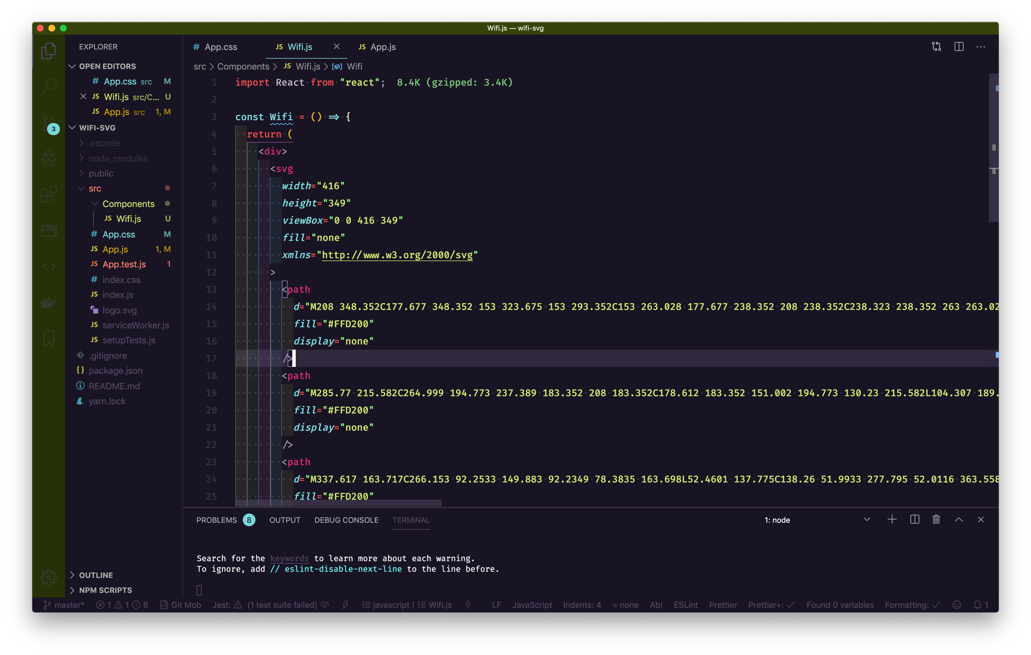
If we check the browser, you won't be able to see the icon.
Now, let's turn the first path "back on"
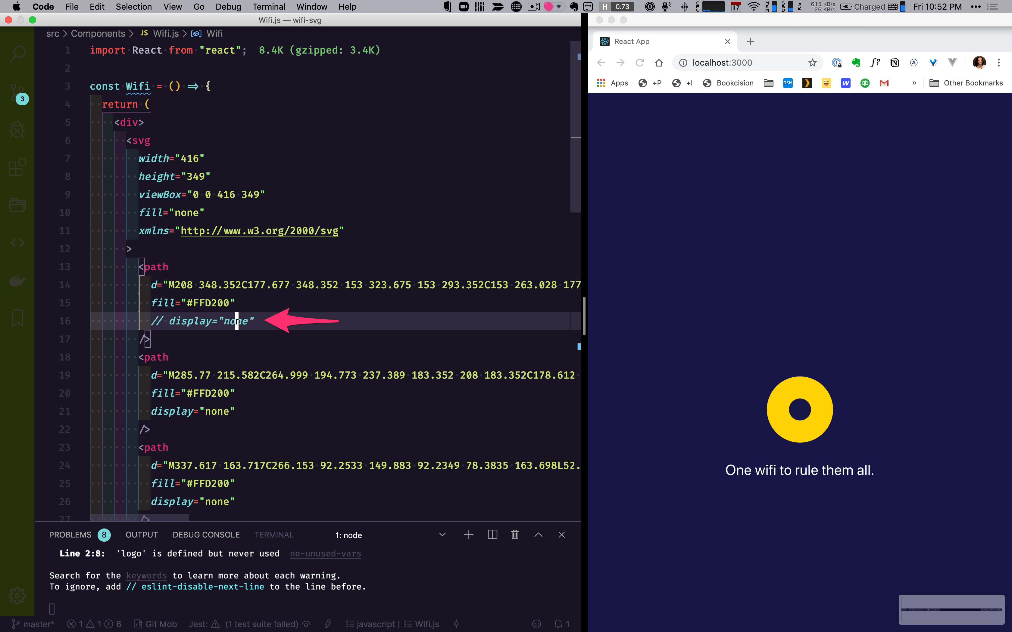
Since it's showing us the first level, let's add an id of id="level-0"`and uncomment display="none" line.
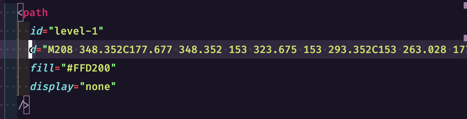
Now, let's do the same with the next path:
Let's add an id="level-2" and uncomment display="none"
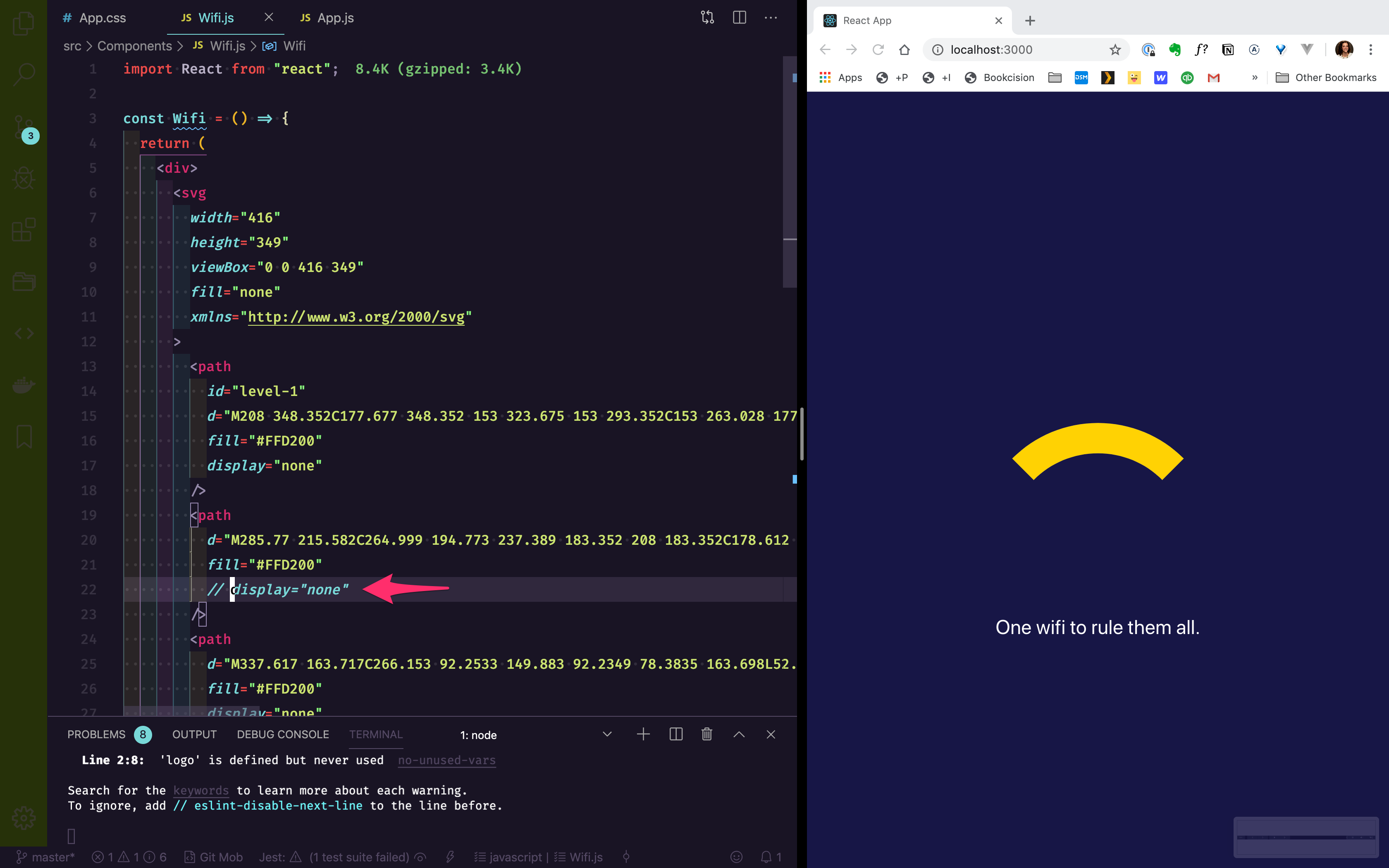
Next.
Let's do the same thing for level-3 and level-4.
This is for when the wifi is turned off. Let's add id="no-wifi" and uncomment display="none"
We can also assume the last one is our exclamation point for when there's an error. Add id="error".
Next, remove all of the display="none" attributes.
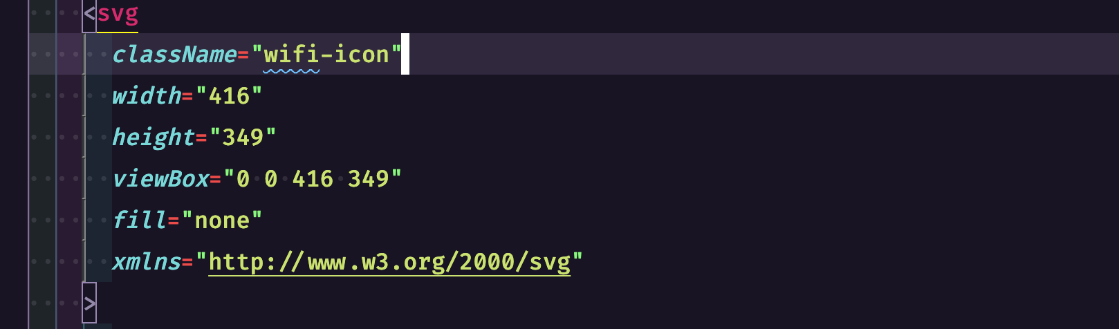
Let's put a class name on our svg so that we can target our elements without worrying about it potentially conflicting with other items on the page.
Open up App.css. Here's the fun part where we can start styling everything.
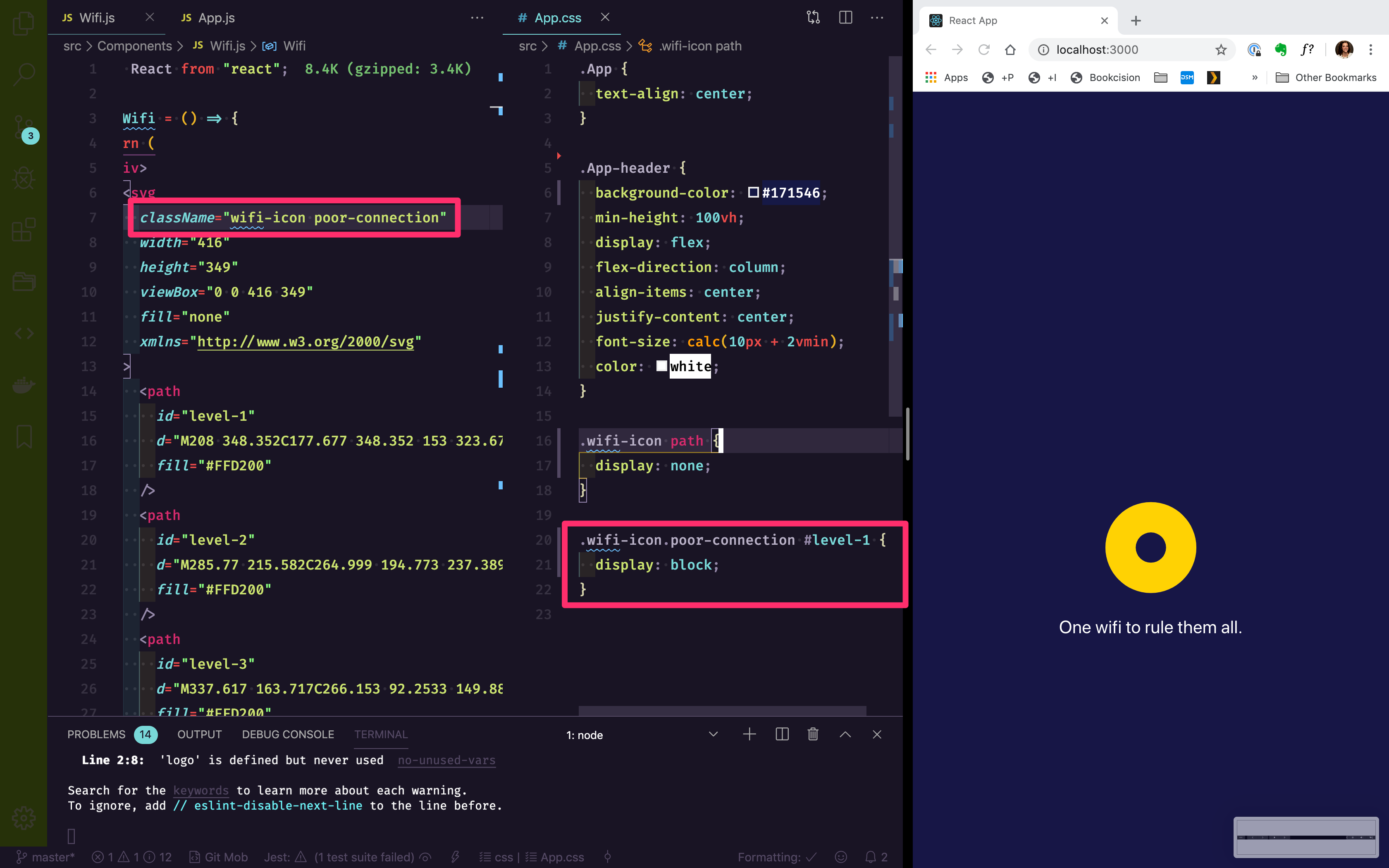
By default, let's hide all our paths and then we'll turn them back "on" based on the state:
1
2
3
.wifi-icon path {
display: none;
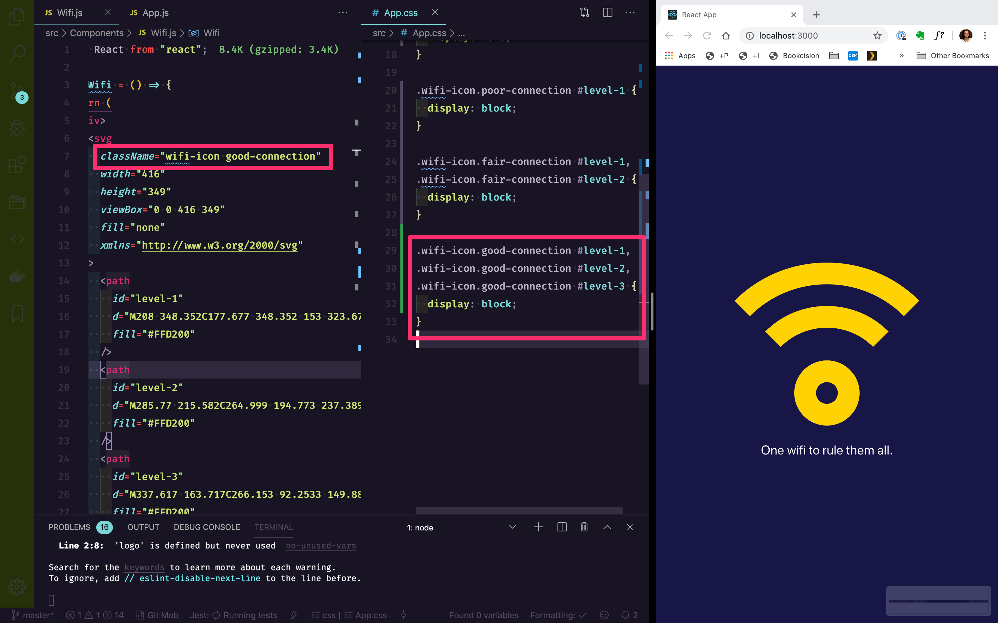
}For a Poor Connection, let's add a class name of poor-connection to the wifi-icon. The only element that we'll need to display is the level-1, which we can target within our CSS:
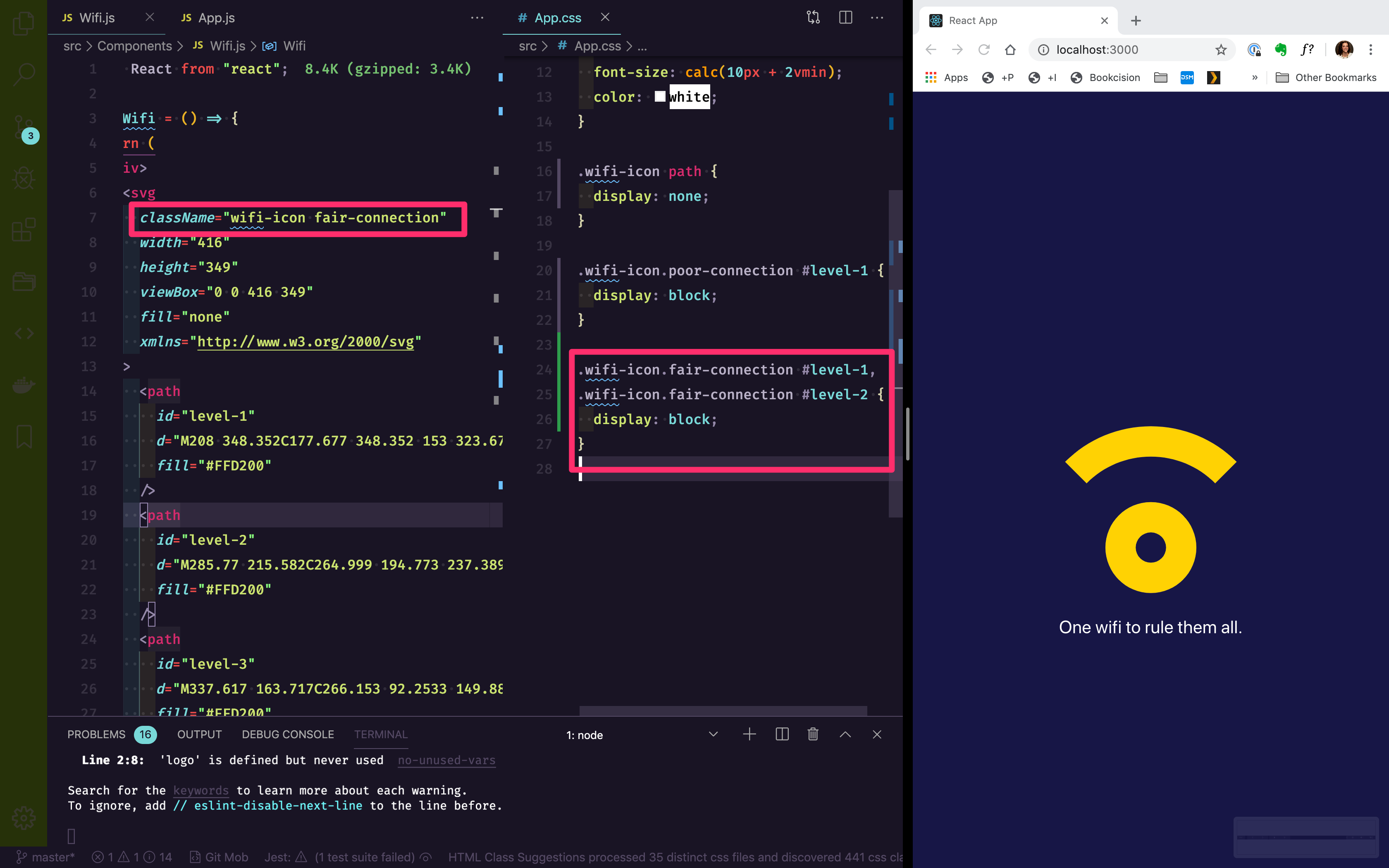
We can do something similar for each of the remaining levels.
Level 2, a fair connection:
Level 3, good connection:
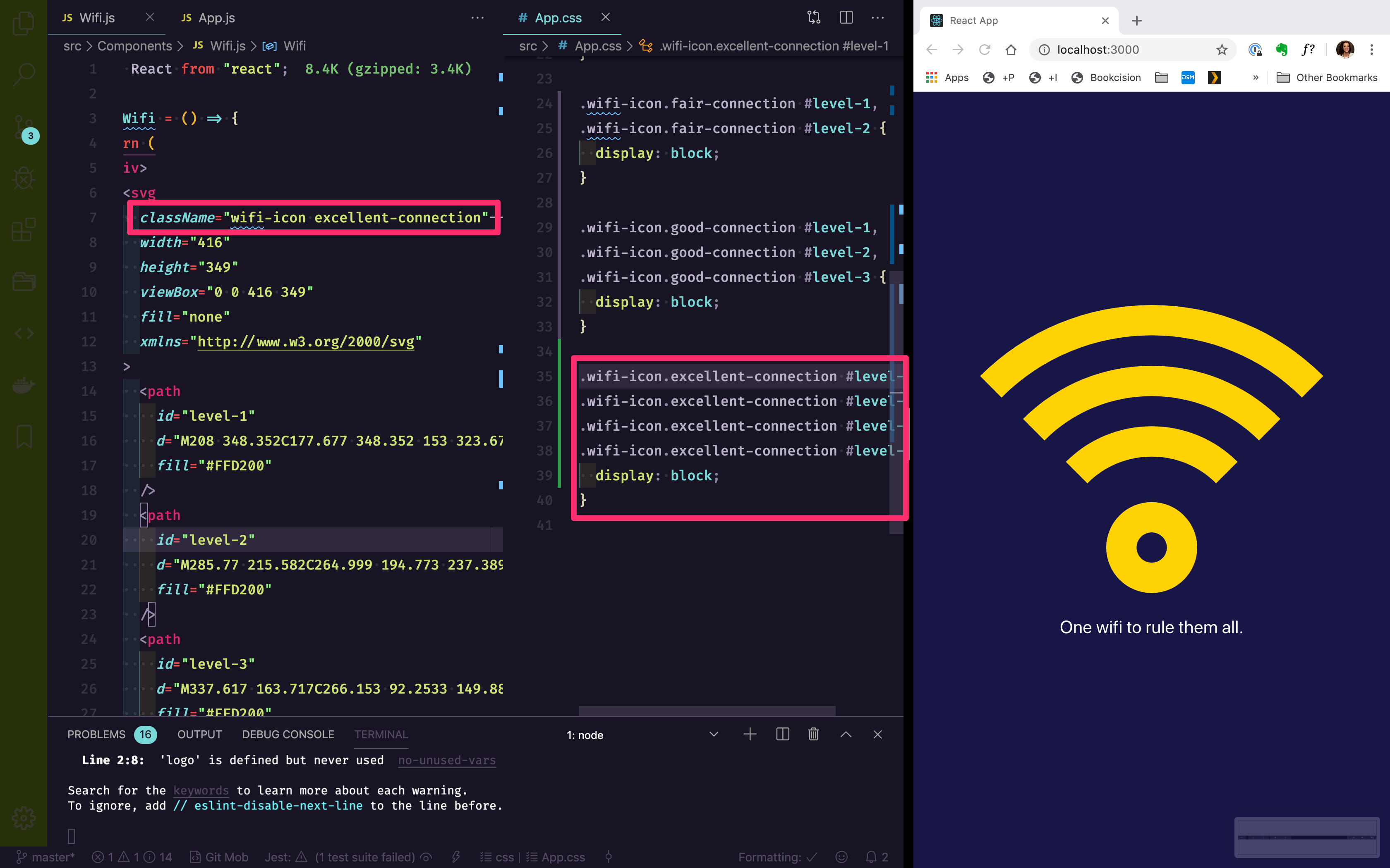
Level 4, excellent connection:
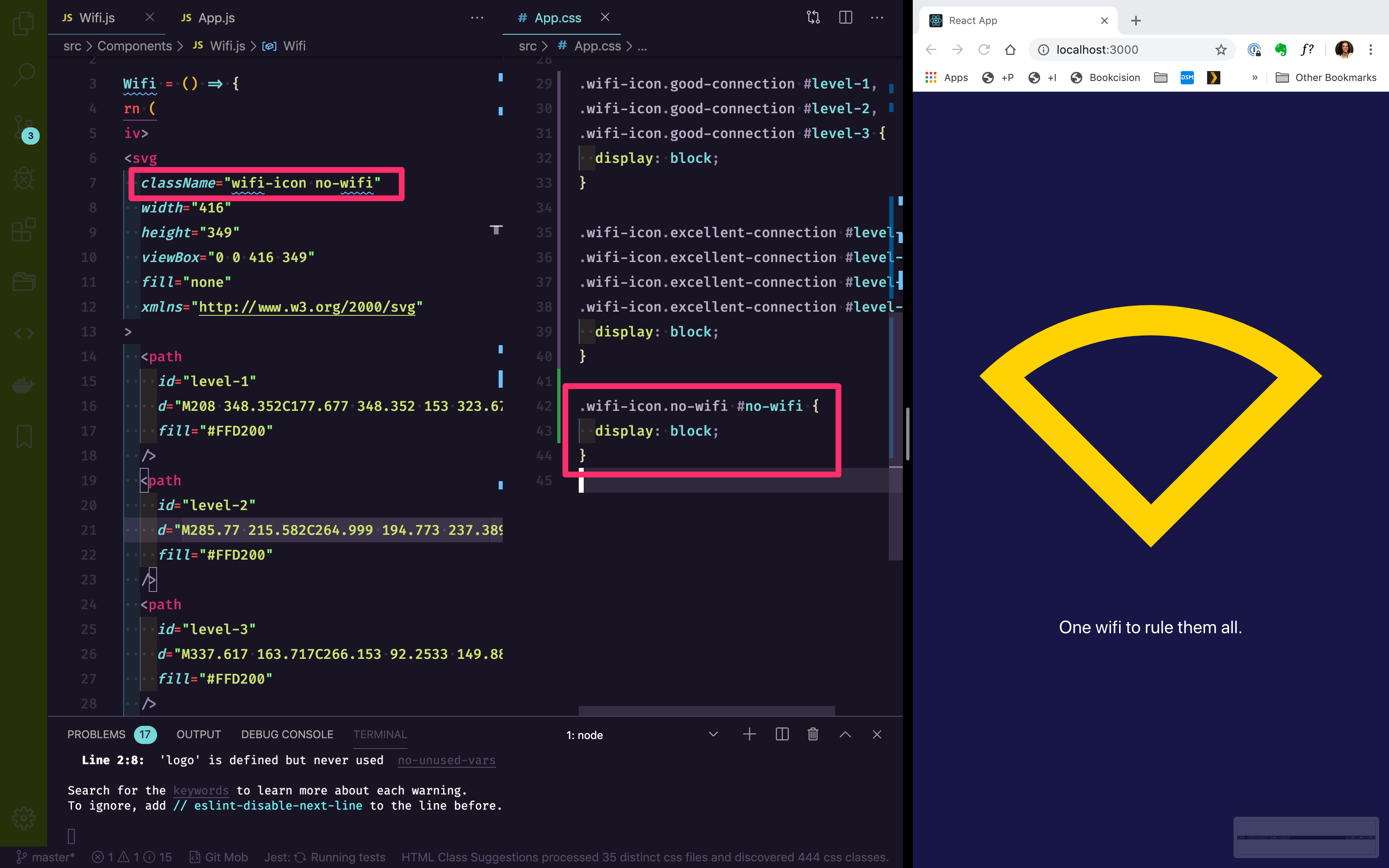
Our no wifi, will be similar. Let's add a class of no-wifi to the wifi-icon and target it within our CSS:
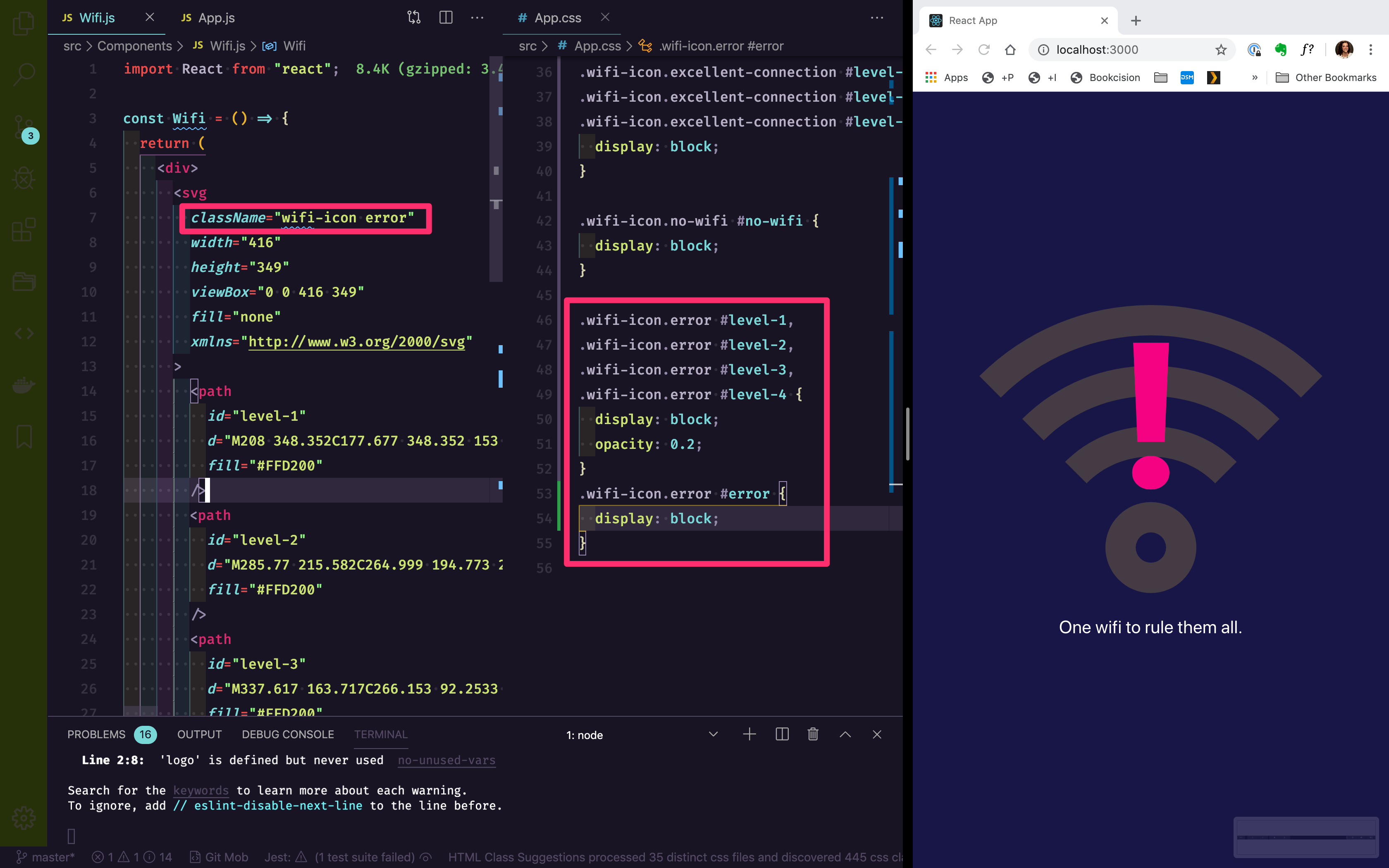
The wifi error state will use a similar method, but we'll need to change the opacity of the levels, as well. Let's add a class of error to wifi-icon.
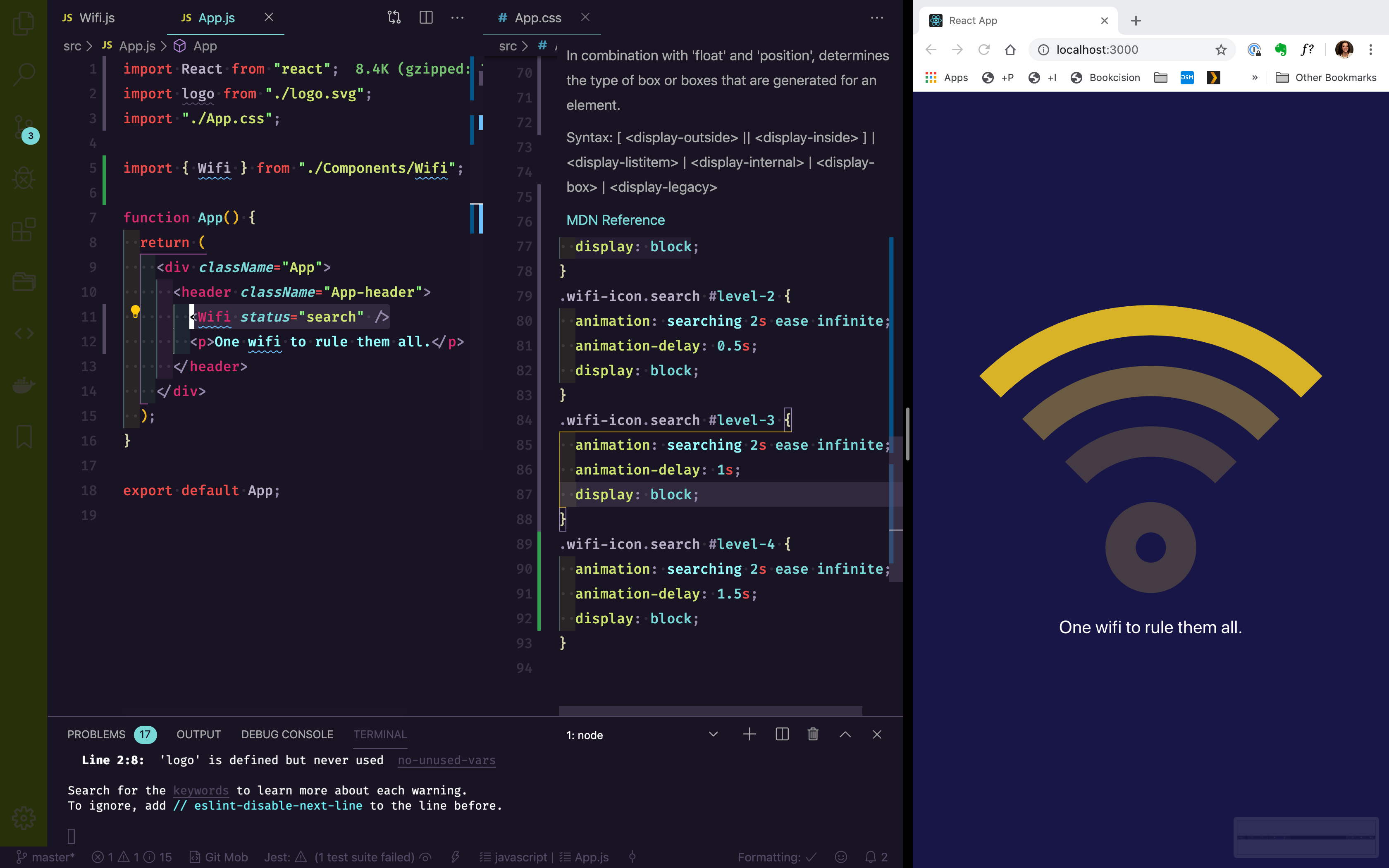
Last state: search. This one is a little different because it's similar to an excellent wifi condition, except each of the bars needs to be animating.
Let's write the animation definition first:
1
2
3
4
5
6
7
8
9
10
11
12
13
14
@keyframes searching {
  0% {
    opacity: 0.2;
  }
  25% {
    opacity: 1;
  }
  50% {
    opacity: 0.2;
  }
  100% {
    opacity: 0.2;
  }
}
I'm going to add a class name of search to wifi-icon and then target each of the levels within CSS:
1
2
3
.wifi-icon.search #level-1 {
 	animation: searching 2s ease infinite;
}
level-1 is fine, but for every level after, I'll delay the animation:
1
2
3
4
5
6
7
8
9
10
11
12
.wifi-icon.search #level-2 {
  animation: searching 2s ease infinite;
  animation-delay: 0.5s;
}
.wifi-icon.search #level-3 {
	animation: searching 2s ease infinite;
	animation-delay: 1s;
}
.wifi-icon.search #level-4 {
	animation: searching 2s ease infinite;
	animation-delay: 1.5s;
}
Obviously, you can speed up or slow down the animation by changing the animation-delay property and the animation-duration that has been defined within the animation property.
The only remaining piece is to make the class that we've been adding to the SVG dynamic so that we can change it on the fly via a react prop.
On line 3, where we declare the Wifi icon, change it to accept a prop of status:
1
const Wifi = ({ status }) => {Now, on line 7, where className="icon-wifi" lives, let's use an inline conditional that says, "if status exists, display the class as icon-wifi and whatever status is. Otherwise, just display the class as icon-wifi"
1
className={status ? `wifi-icon ` + status : "wifi-icon"}Awesome! If you're curious, you can check out all of [the code on GitHub.]()
Now, let's test it, just to make sure.
In App.js change our <Wifi /> component to <Wifi status="search" />. Give it a save and refresh and it should appear as expected within the browser.
🎉 Technically, we're done! We did what we set out to do, but I believe we can take it a step further.
⭐ Bonus Round
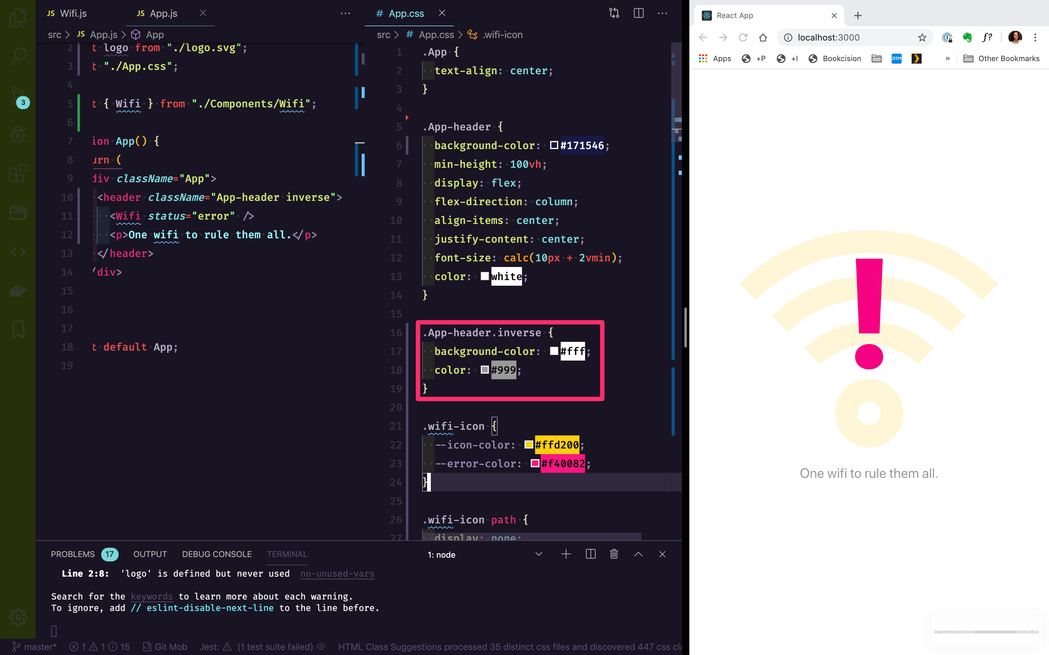
This looks great on a dark background. But, let's pretend for a minute that without app, we want it to appear on a light background. Right now, light and dark themes are all the rage. How do we do this without having to create an entirely different component?
The answer is really quite simple. — Only because SVGs and CSS are perfect for this type of implementation.
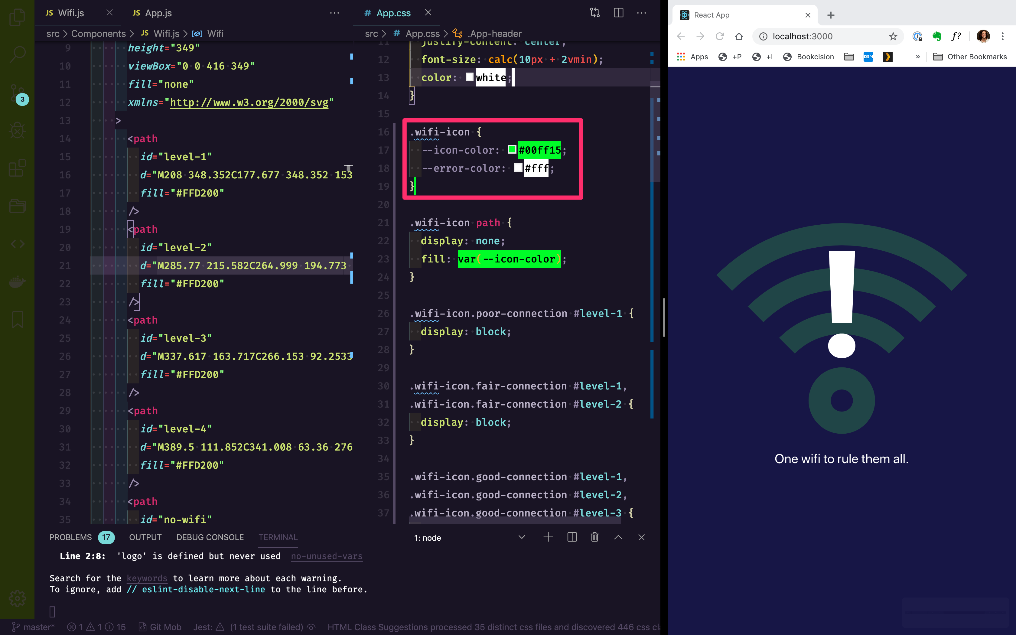
As I mentioned earlier, you can control the color of an SVG with CSS.
Setting up our Variables
Let's set up some variables within CSS to hold our color values.
Now, if you're unfamiliar with variables within CSS, they're pretty easy. When you declare the value, it will look like this, with two -- in front of the name:
1
--yellow: #ffd200;Then, when you want to call it, you use var() and put the name of the variable inside the parentheses. In our case, it might look something like this:
1
2
3
.my-class {
  color: var(--yellow);
}
I told you, it was easy!
The cool part about CSS variables is they're scoped. Meaning, I could define a --yellow inside our icon-wifi class, but create a --yellow variable inside a rainbow class elsewhere. The two won't conflict.
Let's set the default, first. At the top of our App.css document, right below .App-header, let's add the following code (around line 15):
1
2
3
4
.wifi-icon {
  --icon-color: #ffd200;
  --error-color: #f40082;
}
You'll notice that even though the icon-color is yellow, I didn't name it yellow. That's because
I wanted the name to be more semantic. The icon might not always be the color "yellow". We want the names to tell us what they represent, not what they are.
Now, we can set the default, by adding the following line within our .wifi-icon path definition:
1
2
3
4
.wifi-icon path {
  display: none;
  fill: var(--icon-color);
}
Then, just down to our error definition. Update your code to the following:
1
2
3
4
.wifi-icon.error #error {
  display: block;
  fill: var(--error-color);
}
If you're curious to see if these are really working, try changing the hex values in our variable definition:
1
2
3
4
.wifi-icon {
	--icon-color: #00ff15;
  --error-color: #FFF;
}
Within App.js, in our header tag, I'm going to add a class of inverse:
1
<header className="App-header inverse">Within App.css, right below our App-header definition, on line 16, I'm going to make our page have a light background with dark text:
1
2
3
4
.App-header.inverse {
  background-color: #fff;
  color: #999;
}
Right below our variable definitions, around line 26, I'm going to override our variables:
1
2
3
4
.inverse .wifi-icon {
  --icon-color: #26c9c3;
  --error-color: #3452a5;
}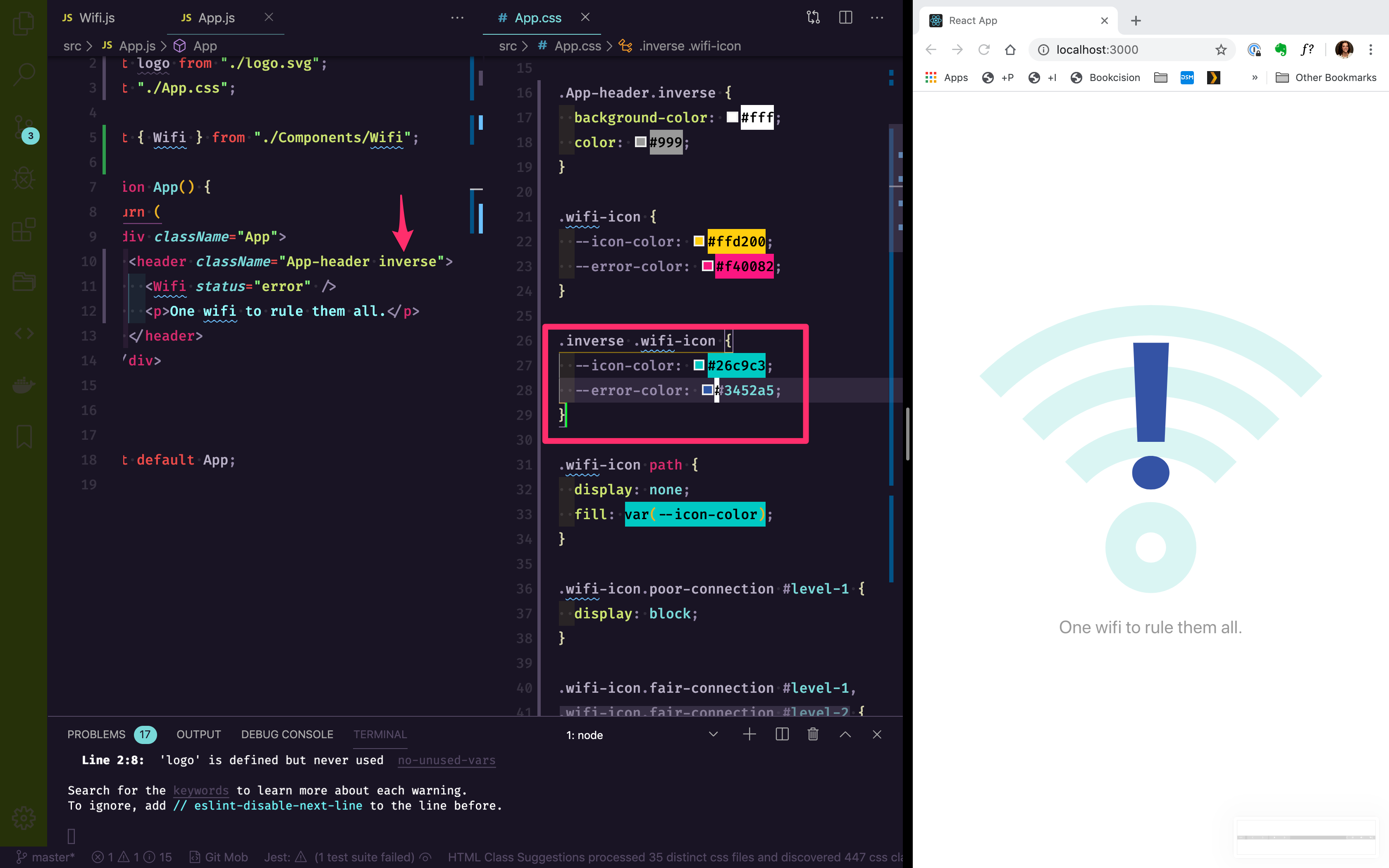
Now, by simply adding or removing the inverse class on the App-header in our app and by changing the status prop on our Wifi component, we have complete control over the icon and the colors being displayed.
WOO HOO!

Comments
This industry moves fast, but you can stay up to date:
Receive a weekly email of the Internet's best from articles, to tutorials, to pro tips.