


Let's make the ultimate icon component in React.
We want to build something that's as reusable and flexible as possible.
Let's do it.
Since this is React component, it only makes sense to start with Create React App.
1
npx create-react-app ultimate-iconThis will take a minute to run.
Let's start cleaning up the pieces a little bit.
Within App.js we can remove all the content. Eventually, our icon will be in the same location as the React logo.
1
2
3
4
5
6
7
8
9
10
11
12
13
14
15
import React from "react";
import logo from "./logo.svg";
import "./App.css";

function App() {
  return (
    <div className="App">
      <header className="App-header">
        <img src={logo} className="App-logo" alt="logo" />
      </header>
    </div>
  );
}

export default App;
In App.css let's clean that file up, too. We can remove all the styles related to the spinning animation and the text link. Should look like this:
1
2
3
4
5
6
7
8
9
10
11
12
13
14
.App {
  text-align: center;
}

.App-header {
  background-color: #282c34;
  min-height: 100vh;
  display: flex;
  flex-direction: column;
  align-items: center;
  justify-content: center;
  font-size: calc(10px + 2vmin);
  color: white;
}
First, let's talk about how we want this component to work:
- I want to have a single
<Icon />component that will show me whatever icon I'm asking for. - I want to be able to change the color and the size within the code
Now, let's create a folder, called components. Inside, let's create another folder called Icons. We'll keep everything related to our component here.
Now, let's create a file named index.js.
Inside, I'm going to type rafc. I have an extension within my VS Code editor that will use this snippet to stub out a functional react component.
I'm going to turn this a named export. Why? Because consistency prevents errors. I won't have to think twice about whether a component is a named export or a default export, because everything is a named export.
1
2
3
4
5
6
7
8
9
10
11
import React from 'react'

const Icon = () => {
  return (
    <div>

    </div>
  )
}

export { Icon }
I'm going to just add text "Icon" between the <div> tags to make sure that it's loading correctly within our App.
1
2
3
4
5
6
7
import React from "react";

const Icon = () => {
  return <div>Icon</div>;
};

export { Icon };
Within App.js I'm going to import our new file and replace the <img> tag with our component:
1
2
3
4
5
6
7
8
9
10
11
12
13
14
15
16
import React from "react";
import logo from "./logo.svg";
import { Icon } from "./Components/Icons";
import "./App.css";

function App() {
  return (
    <div className="App">
      <header className="App-header">
        <Icon />
      </header>
    </div>
  );
}

export default App;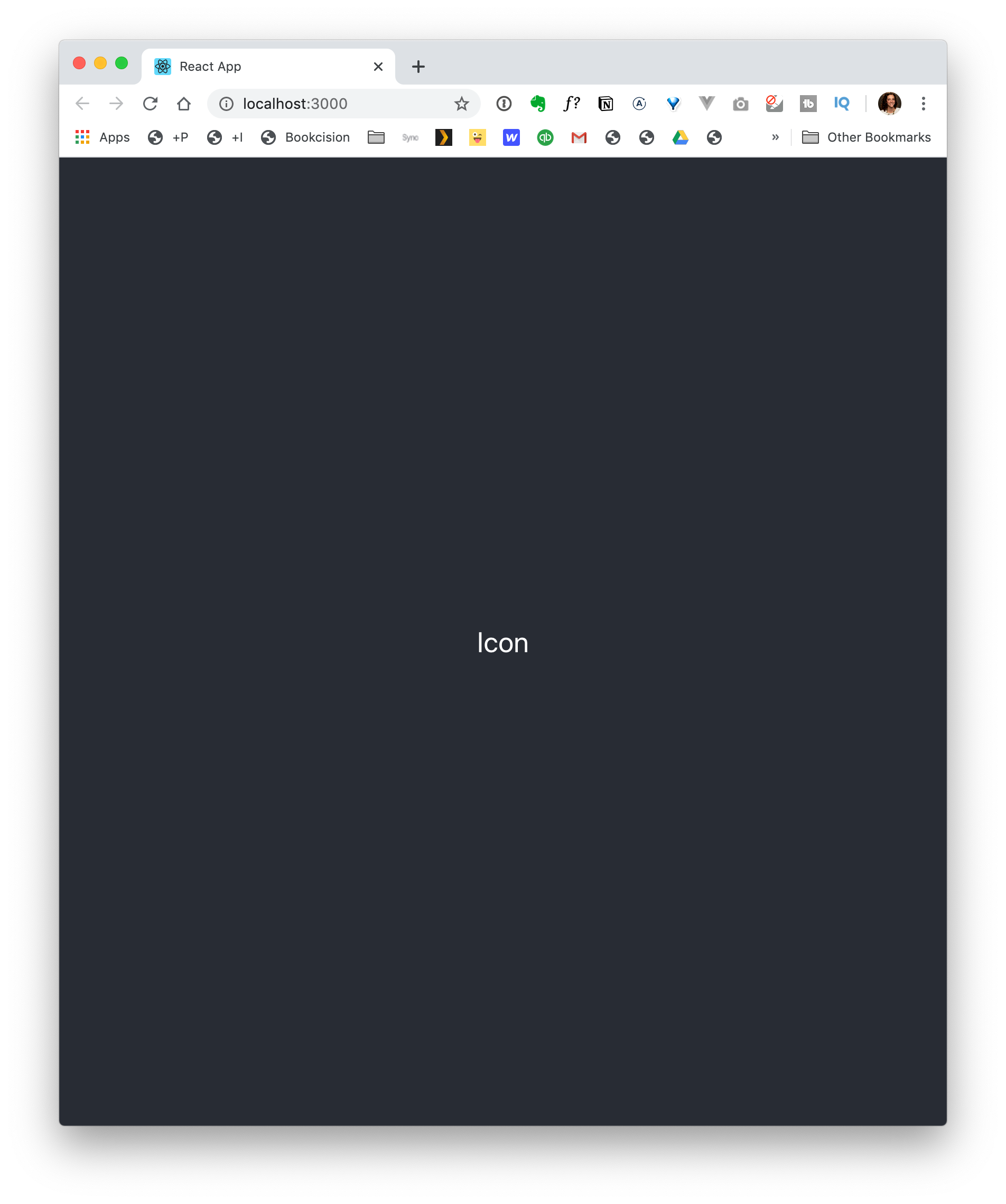
Great! Now, let's create a few icons.
Within the Components/Icons folder, let's create three new files: Facebook.js, Instagram.js, and Twitter.js.
As you might have guessed, we're going to add SVG icons to each of these files.
I'm going to jump over to Figma. The trick is that each icon has the same size bounding box. In this case, all our icons are going to be 25 x 25.

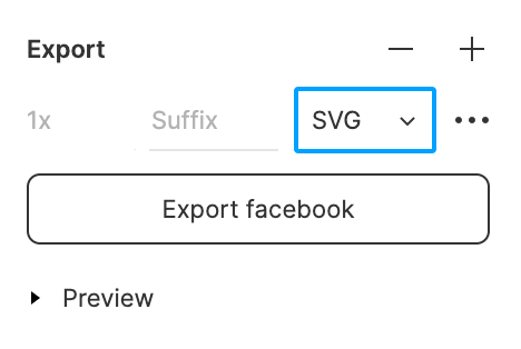
Within Figma, I can select each icon, then click on the + in the Export section, select SVG, and click on the Export button. The file will download to my desktop.
I'm going to do this for Facebook, Instagram, and Twitter.
Now, I'm going to grab the Facebook.svg and open it directly within VS Code. You'll notice it looks like a bunch of gobbly gook. That's OK. I'm going to copy it and open Facebook.js.
1
2
3
<svg width="25" height="25" viewBox="0 0 25 25" fill="none" xmlns="http://www.w3.org/2000/svg">
<path fill-rule="evenodd" clip-rule="evenodd" d="M9.14062 13.8281V25H14.6094V13.9062H18.3594L19.2969 9.29687H14.6875C14.6875 9.29687 14.6875 7.10938 14.6875 5.85938C14.6094 5.39062 14.8437 4.6875 15.625 4.6875C16.7969 4.6875 18.2812 4.6875 18.2812 4.6875V0C18.2812 0 15.9375 0 13.3594 0C11.6406 0 9.14062 2.10938 9.14062 4.29688C9.14062 6.5625 9.14062 9.0625 9.14062 9.0625H6.25V13.75L9.14062 13.8281Z" fill="#161743"/>
</svg>
I'm going to use that rafc shortcut again.
We're going to change this to a named export export { Facebook }
and paste the code from our Clipboard into our return statement.
1
2
3
4
5
6
7
8
9
10
11
import React from 'react'

const Facebook = () => {
  return (
    <svg width="25" height="25" viewBox="0 0 25 25" fill="none" xmlns="http://www.w3.org/2000/svg">
      <path fill-rule="evenodd" clip-rule="evenodd" d="M9.66731 13.7104V24H14.7177V13.7592H18.1653L19 9.48987H14.7539V6.35828C14.7539 5.92559 14.9867 5.34772 15.6938 5.34772H18.1479V1H13.5646C11.9836 1 9.64991 2.92984 9.64991 4.98188V9.36913H7V13.6924L9.66731 13.7104Z" fill="#1B1B3A" />
    </svg>
  )
}

export { Facebook }
There are a few properties here that we want to be dynamic. We can pass those in as props:
1
2
3
4
5
6
7
8
9
10
11
import React from 'react'

const Facebook = ({className, height, width}) => {
  return (
    <svg width={width} height={height} viewBox="0 0 25 25" fill="none" xmlns="http://www.w3.org/2000/svg">
      <path fill-rule="evenodd" clip-rule="evenodd" d="M9.66731 13.7104V24H14.7177V13.7592H18.1653L19 9.48987H14.7539V6.35828C14.7539 5.92559 14.9867 5.34772 15.6938 5.34772H18.1479V1H13.5646C11.9836 1 9.64991 2.92984 9.64991 4.98188V9.36913H7V13.6924L9.66731 13.7104Z" fill="#1B1B3A" />
    </svg>
  )
}

export { Facebook }
I'm going to add className
and I want to remove any inline references to fill. We want to be able to control the color with CSS and if they're inline, that will take precedence over our CSS.
1
2
3
4
5
6
7
8
9
10
11
import React from 'react'

const Facebook = ({className, height, width}) => {
  return (
    <svg className={className} width={width} height={height} viewBox="0 0 25 25" xmlns="http://www.w3.org/2000/svg">
      <path fill-rule="evenodd" clip-rule="evenodd" d="M9.66731 13.7104V24H14.7177V13.7592H18.1653L19 9.48987H14.7539V6.35828C14.7539 5.92559 14.9867 5.34772 15.6938 5.34772H18.1479V1H13.5646C11.9836 1 9.64991 2.92984 9.64991 4.98188V9.36913H7V13.6924L9.66731 13.7104Z" />
    </svg>
  )
}

export { Facebook }
You may notice that when I hit save, the code automatically re-formats itself. I have an extension within VS Code called Prettier that does that for me. I'll include a link in the description below.
Now, let's do the same thing for our Twitter and Instagram icons.
Let's copy and paste the code from Facebook.js inito Twitter.js and Instagram.js. I'm going to change the name of the component and the export.
Now, I'm going to open Twitter.svg and copy the code and paste it into Twitter.js, overwriting the Facebook SVG.
1
2
3
4
5
6
7
8
9
10
11
12
13
14
15
16
17
18
19
20
21
22
import React from "react";

const Twitter = ({ className, height, width }) => {
  return (
    <svg
      width="25"
      height="25"
      viewBox="0 0 25 25"
      fill="none"
      xmlns="http://www.w3.org/2000/svg"
    >
      <path
        fill-rule="evenodd"
        clip-rule="evenodd"
        d="M23 5.89433C22.2644 6.21549 21.4737 6.43267 20.6431 6.53049C21.4906 6.0303 22.1413 5.23848 22.4475 4.29593C21.655 4.75859 20.7763 5.09452 19.8419 5.27601C19.0938 4.49096 18.0269 4 16.8469 4C14.5806 4 12.7437 5.80881 12.7437 8.03907C12.7437 8.35592 12.7794 8.66416 12.85 8.96009C9.43937 8.79089 6.41625 7.18327 4.3925 4.73952C4.03938 5.33631 3.83688 6.0303 3.83688 6.77044C3.83688 8.17196 4.56125 9.40798 5.66188 10.1321C4.98938 10.1112 4.35687 9.92971 3.80375 9.62701C3.80312 9.64362 3.80313 9.66085 3.80313 9.67746C3.80313 11.6345 5.2175 13.2674 7.095 13.6384C6.75063 13.7307 6.38813 13.7799 6.01375 13.7799C5.74938 13.7799 5.4925 13.7547 5.24187 13.7079C5.76375 15.3125 7.27938 16.4802 9.075 16.5128C7.67063 17.5962 5.90125 18.2416 3.97875 18.2416C3.6475 18.2416 3.32125 18.2226 3 18.185C4.81563 19.3312 6.9725 20 9.28937 20C16.8375 20 20.9644 13.8451 20.9644 8.50727C20.9644 8.33254 20.9606 8.15843 20.9525 7.98493C21.7544 7.41583 22.45 6.70399 23 5.89433Z"
        fill="#1B1B3A"
      />
    </svg>
  );
};

export { Twitter };
I'll plug in the prop values for width and height and create one for className.
Remove any references to fill.
Last one: Instagram. Same old story.
Now, let's jump back to our Icon/index.js file. This is where we'll start to tie all these pieces together.
At the top, we want to import all of the icons that we've created:
1
2
3
import { Facebook } from "./Facebook";
import { Instagram } from "./Instagram";
import { Twitter } from "./Twitter";
Within the component, we want to be able to pass in the name of the icon and have it return the correct icon component.
Let's accept our props:
1
2
3
const Icon = props => {
  return <div>Icon</div>;
};
If we were right to write this as an if / else conditional, this is what our code would look like:
1
2
3
if (props.name.toLowerCase() === 'facebook') {
	...
}
This line props.name.toLowerCase() says when we pass in name as a prop and make it lowercase. — this way our code will work regardless of whether we pass in a name as all caps or all lowercase letters. — if I pass in Facebook, return the Facebook component.
1
2
3
if (props.name.toLowerCase() === 'facebook') {
	return <Facebook {...props} />
}
The {...props} is called a spread. It just takes all the props that we pass in and passes it straight on to the component. — So, the height, width, and className props that we set up within our Facebook.js component — it will pass all those props along without us having to define everything.
Now, to write the else if
1
2
3
4
5
6
7
else if (props.name.toLowerCase() === 'twitter') {
	return <Twitter {...props} />
}

else if (props.name.toLowerCase() === 'instagram') {
	return <Instagram {...props} />
}
Then, at the end, we want to say: "If you still didn't find what we're looking for, just give us an empty div"
1
2
3
else {
	return <div />;
}
Anytime you start to see yourself repeating code, that's a "code smell" — it's a good opportunity to refactor. You'll probably notice that we're using that props.name.toLowerCase() a lot. And really, we keep checking the same thing. A switch statement is perfect for this scenario.
Here's what it looks like:
1
2
3
switch (props.name.toLowerCase()) {

}
The props.name.toLowerCase() is what we're testing against each time. Then, below, we have a "case" statement. If our props.name.toLowerCase() is equivalent to Facebook then it will run the code.
1
2
3
4
switch (props.name.toLowerCase()) {
	case "facebook":
		return <Facebook {...props} />;
}
So, we just want to turn each of those conditional lines into a case statement:
1
2
3
4
5
6
7
8
switch (props.name.toLowerCase()) {
	case "facebook":
		return <Facebook {...props} />;
	case "twitter":
		return <Twitter {...props} />;
	case "instagram":
		return <Instagram {...props} />;
}
Now, for our else in our conditional statement. It's the default if nothing else is true, it will run:
1
2
default
	return <div />;
Now, with that setup, let's jump back over to our App.js and pass in a name for the icon we want to display:

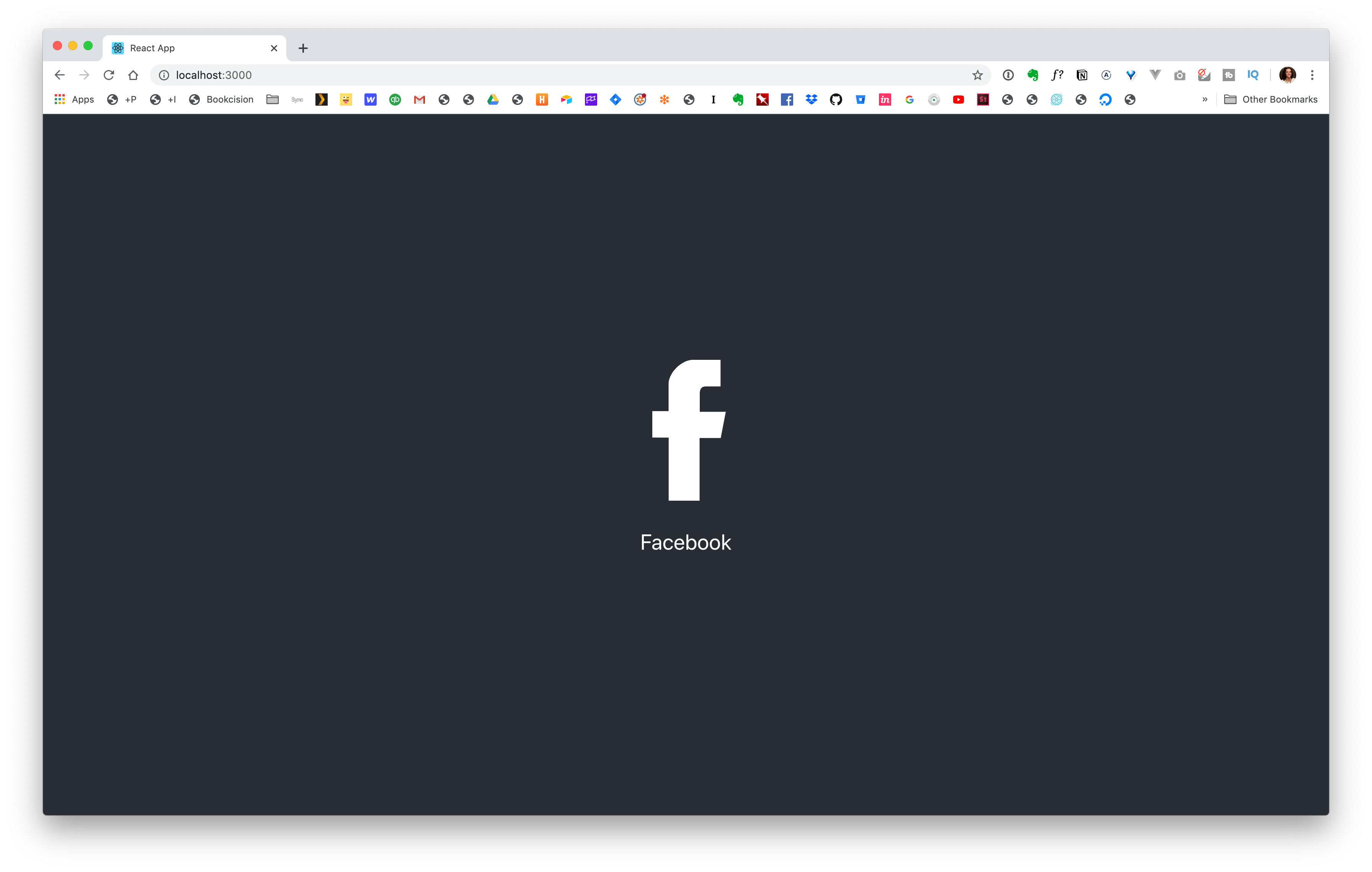
Aswesome, it worked!
We just need to reign in the size and the change the color. Remember, our width and height are props we can pass in. Let's jump back over to App.js and update our component:
1
<Icon name="facebook" width="200" height="200" />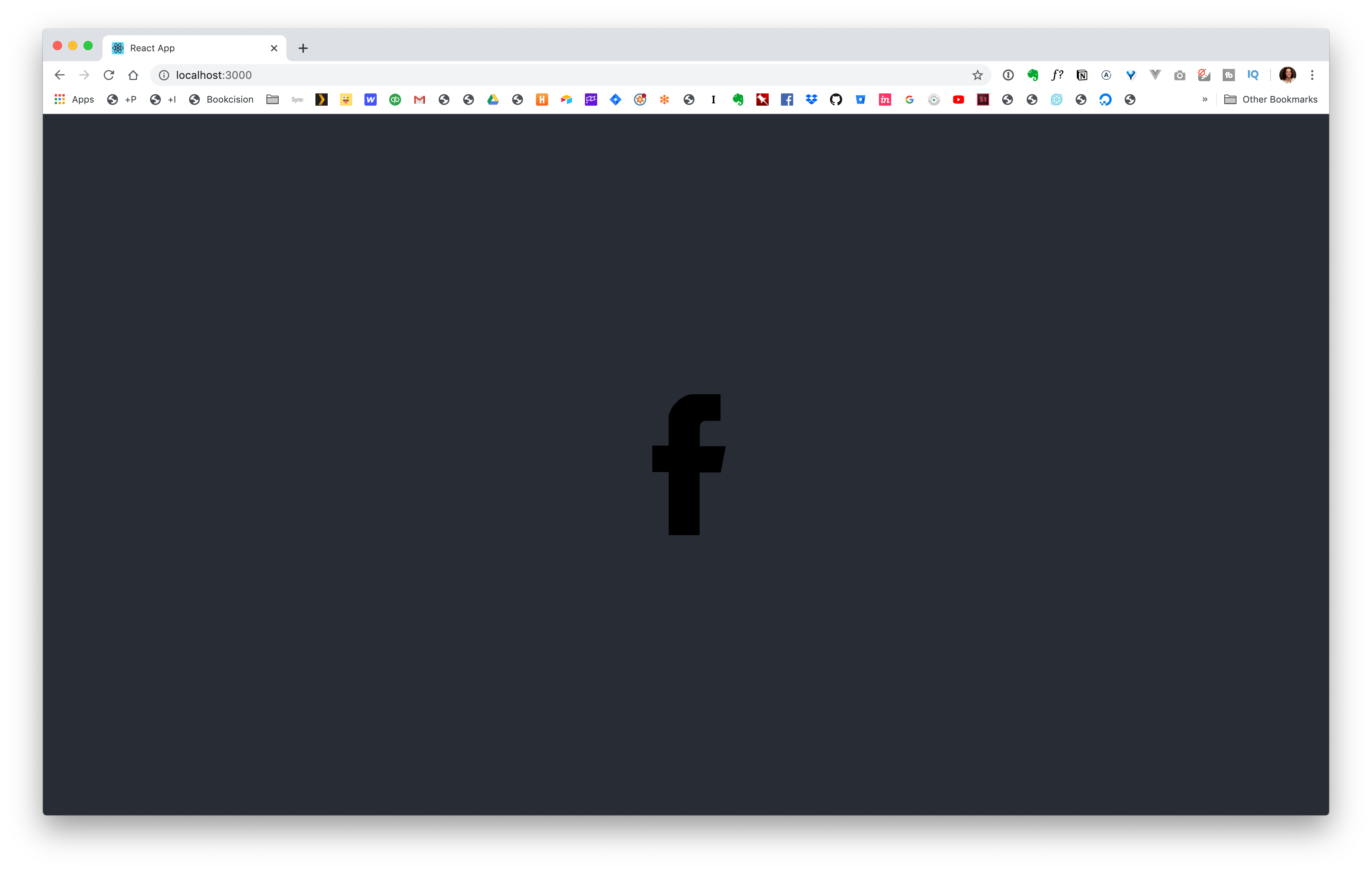
Now, we just want to change the color. Within App.css we can add this block:
1
2
3
svg {
  fill: yellow;
}
When you're targeting the color of an svg, you use fill instead of color. You could use whatever color you want: yellow
Save. See it update.
cyan
Save it update.
Or, a little trick I like to use is when we want it to adobe the text color of the parent. You can use currentColor.
I'll add the text, "Facebook", below our icon to show you what I mean.
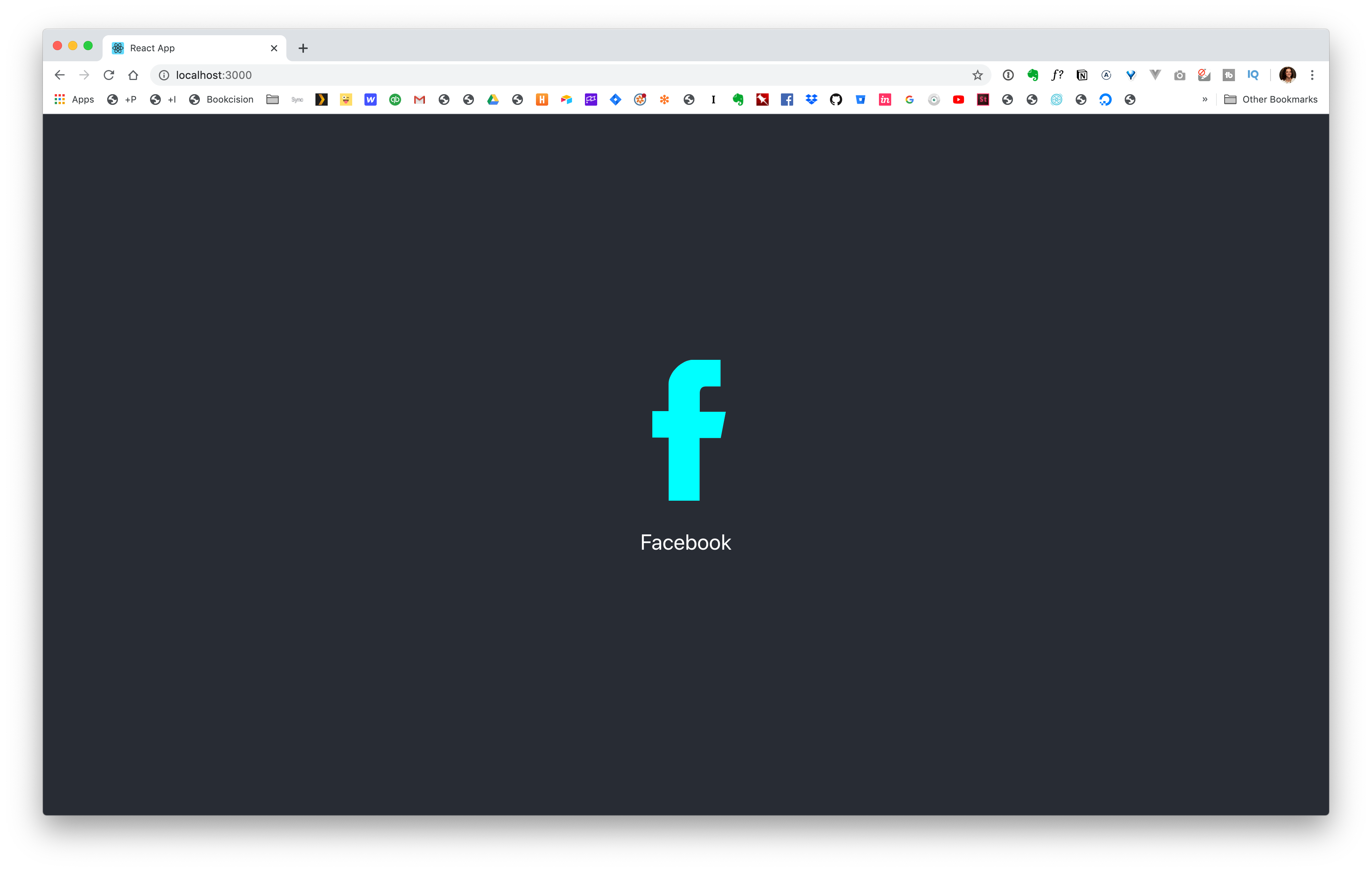
Here, the text is white because of color: white; property on .App-header
We can have our icon inherit that color by changing cyan to currentColor.
1
2
3
svg {
  fill: currentColor;
}

Comments
This industry moves fast, but you can stay up to date:
Receive a weekly email of the Internet's best from articles, to tutorials, to pro tips.